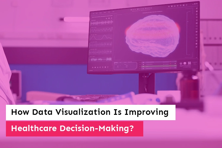
How Data Visualization Is Improving Healthcare Decision-Making?
The fact that data and its presentation are present in almost every aspect of modern life compels us to ponder the following questions: how does data visualization influence medical applications? and what part does it play in patients’ diagnoses?
Patients undoubtedly entrust their health to the standards and judgments made by healthcare experts; yet, what do physicians, nurses, practitioners, and other healthcare professionals use as the foundation for their judgment and decisions?
When it comes to complex medical diagnoses, medical professionals need to base their decisions and judgments on accurate information coming from a variety of sources, such as laboratory analyses made by experts (for example, medical technologists) who are constantly involved in working with medical observations, samples, data, test results, and researches, among other things.
Although experience is a factor that drives medical decisions, when discussing complex medical diagnoses, medical professionals need to base their decisions and judgments on accurate information coming from a variety of sources.
According to Statista, the quantity of data created in the healthcare industry in 2013 was 153 exabytes (1 exabyte is equal to 1 billion gigabytes), and by the time the year 2020 came to a close, it had already climbed to the staggering figure of 2,314 exabytes.
It is essential for medical personnel who treat hundreds of patients annually to rely on data that is dependable and correct; but, how can data visualization benefit the field of medicine?
The Practice of Data Visualization in Medical Care

Data analysts may better explain the outcomes of their analyses by using tactics that include data visualization. Examples of this may be found in the realm of health care and include ratings of patient satisfaction shown as a bar graph, trends in staffing and operations displayed as a line graph, and health care efficacy displayed as a pie chart.
Hospitals have the ability to develop data streams and visualizations that have the potential to enhance care delivery systems by using software applications such as Microsoft Excel and Microsoft PowerPoint, as well as SQL, Google Analytics, and Tableau. The following is a list of examples of data capture and visualization technologies that are regularly used in hospitals:
In most cases, comments from customers and assessments of their level of satisfaction are gathered via the use of surveys. A survey may uncover chances for organizational development via quantitative (asking respondents to “grade your happiness with your visit on a scale of 1 to 10”) and qualitative (providing respondents with an extra remarks section) tactics.
Also Read: 10 Reasons Why you Need To Switch From Excel To Power BI For Data Analytics
- Scorecards are useful tools that are used to monitor progress. When using this tactic, it is not uncommon for medical personnel to make use of scorecards in order to monitor the development of their patients.
- The various data streams may be housed in dashboards. Because they are interactive and can be customized, analysts are able to enter the programme, get the necessary data, and build graphs and charts that can be used in presentations.
- Health care providers may employ data visualizations to present data for diverse audiences. Instead of just displaying raw data, visualizations allow the analyst to construct a narrative that is lucid and to the point about the facts being shown.
- In order for a team to realize the advantages of data visualization development, they must first choose a project in which the use of data might be beneficial. In an ideal scenario, the project would concentrate on a topic that has high organizational visibility and value, has a high possibility of being successful, and is simple enough to be completed in a period of ninety days. After that, analysts formulate a hypothesis about the project, and they start collecting pertinent data from the designated data sources (inventory lists, customer feedback).
- An analyst is able to design an automated pipeline for the purpose of processing data and modeling it into visualization by using technologies such as Tableau developers and Microsoft Power BI. In many cases, the data that is being gathered by a data source will need some kind of modification before it can be accepted by the system. Either via the data source itself or through a dashboard application such as Tableau or Power BI, the process of configuring data transformation may be carried out by tableau developers.
- An analyst is able to pick a visualization method after they have determined the data source, understood the required data transformation, and developed an automated procedure. These representations may take the form of charts, graphs, or any other diagrams that transform rows of data into a visual in order to explain the data narrative. The analysts need to get together with the stakeholders to determine their preferred visualizations.
After the data visualizations have been generated from the dashboards, they may be exported and utilized in other applications, such as PowerPoint or Excel, which are used for reporting and presentations.

The analyst is able to explain results to the audience in a form that is both clear and engaging with the assistance of the data visualization. The audience may consist of the board of directors of the health care institution or a public health organization.
The Benefits That Can Be Derived From Utilizing Data Visualization
The practice of employing data visualization in medical care comes with a number of important advantages. The following are some of the ways that the display of data may make a hospital more efficient.
- The Coordination of Care
Data visualization, which reduces the complexity of patient care data, enables nurses to more readily evaluate studies and exploit the knowledge they have. Additionally, it enables medical personnel to examine the data of other patients who have had the same symptoms in order to get an understanding of typical healing durations.
Patient Education Businesses use data visualization to show how an individual’s health state compares to that of others in the same demographic group. Patients may learn about aspects of their health that require improvement, such as their cholesterol levels, body mass index, and exercise routines, via the use of such images.
Also Read: Top 9 Best Power BI Dashboard Examples For 2022
Data visualizations from the field of public health are often used by the media in order to show health-related tendencies on a broad scale. One such illustration would be the distribution of confirmed COVID-19 cases among the states of the United States.
It’s possible that the visualization will include a graph of the United States with shading to demonstrate which states have been most severely impacted by the outbreak.
Data from operations may contribute to increased organizational transparency by enabling the identification and measurement of particular teams and people, as well as the evaluation of their performance in comparison to the metrics that apply to them. This has the potential to help teams learn from one another, exchange techniques that are successful, and enhance the operational strategy of the firm.
- Planning that is in advance
Because trends provide an advantage to those who develop solutions, problems are addressed more quickly. In point of fact, one is able to begin working on problems before they ever occur if they have a solid grasp of data visualization and carry out an analysis of it.
This allows for predictive and proactive planning to solve difficulties, which in turn assures that the business will continue to run without interruption. Maintaining an awareness of current trends will allow you to make strategic plans to enhance the development potential of your business and push it to the next level.
- Making amends for past mistakes
It is feasible to discover faults and errors, just like it is possible to identify patterns. Data visualization gives you the ability to learn about the most recent advancements in a variety of sectors of healthcare, which in turn keeps you informed about the locations of the errors that occur.
When information is presented in graphs and charts, it is much easier to comprehend it, which makes it much simpler to spot flaws in the data. The sooner the inaccurate data is identified, the sooner a decision will be made about how to rectify the situation.
When data visualizations provide an inaccurate view of the world, you have the opportunity to identify potential mistakes and put appropriate corrective measures into place.
- The Diagnosis for Patients Who Are at High Risk
Data visualization makes it easier to categorize patients according to their risk levels, from low to high. Through the use of images and graphics, medical professionals are able to determine which patients need immediate attention and treatment.
They are able to categorize the patients according to the severity of their diagnoses and forecast which patients would need intensive care in the not too distant future.
Also Read: Data Visualization: Not Data, Decisions Should Drive Business Goals
The ability to concentrate on the data that helps detect the patient’s health pattern based on the frequency of visits and chronic medical difficulties may be provided through data visualization, which allows healthcare practitioners to do so. Not only will this improve the precision of the therapy, but it may also assist in the preparation of the ICU procedure in advance.
- Acquiring an understanding of the data patterns
Human brains are better able to comprehend information when it is presented visually, such as in charts and graphs. In contrast to this, the conventional approaches to data analysis include the laborious process of manually organizing a thousand rows and columns of sheet data into a single database table.
The healthcare industry needs a system that can effectively convey significant insights and useful information, backed up with appropriate images. Business users are able to comprehend the relationship between the overall picture and the current state of healthcare when the information is brought into order and impact.
When experts are able to spot the particular patterns, they are able to discover the regions that have a significant influence on their company. Eventually, they will be able to move their attention to significant crucial areas that need greater attention and think of ideas that may work for the organization’s future development.
- Enhanced capabilities in terms of analysis
Storytelling is often at the heart of both data analysis and visualization. On the dashboard, the data and images are organized in a manner that makes sense, and they speak to many different parts of the company.
For instance, it might be about yearly income, variables impacting growth, the effect of marketing initiatives, the successful creation of products and how users respond, etc. It is much easier to evaluate the tale that is hidden behind the visuals and charts if they are kept as basic as possible.
Companies are able to hone their judgments and aptitude for areas that might lead to increased profitability and product enhancements if they conduct excellent data visualization and analysis. An improvement in analysis also suggests there is a possibility of progress being made in medical research and development.
The Capabilities of Business Analytics and the Visualization of Data

The ability to do business analytics is crucial to data visualization. The skill set of a business analyst often includes competence with dashboards and data applications.
It is also necessary to have analytical abilities in order to analyze and alter the data. It helps to have a persistent mindset as well as a strong interest in data in order to finish tough undertakings.
The ability to analyze critically and communicate effectively is another essential core quality possessed by business analysts. In addition to making reports on their results in an interesting manner, analysts are required to construct an efficient data stream and visualization plan.
Understanding the objective of the study and effectively explaining that reason is key to gaining the understanding of companies and having visualizations made.
An advanced degree in business analytics may assist people in the analytics field in honing these skills and preparing for a job in the healthcare industry that is both distinctive and exciting.
A person may get the knowledge necessary to accelerate the procedures involved in health care by putting data visualization tactics into practice by enrolling in an online programme.

Conclusion
The monitoring of hospital operations, patient profiling, demand prediction, and capacity planning are just some of the areas in today’s healthcare systems that might benefit from the use of data visualization development tools.
On the other hand, improvements in technology in recent years have made it easier to deal with data than it ever was in the case of business intelligence. This is the case regardless of when the changes took place.
It is no longer required to deal with complicated data sets that take a significant amount of time to filter through and comprehend. Users of modern data dashboards have the ability to view data in a visual format, which enables business choices to be made more quickly and accurately. It is now beyond reasonable question that participating in the big-data and advanced-analytics management revolution will result in financial gain.
Similar Posts

[Updated] Top 18 Best Power BI Dashboard Examples
Looking for the best Power BI dashboards examples? You have come to the right blog! Microsoft Power BI is a powerhouse when it comes to data analytics and visualization, offering a load of tools and features to cater to various business needs. Creating business dashboards is one of the most impactful features among its many […]...
10 Industries Revolutionized by Business Intelligence Analytics
Back in the 1960’s companies used to make decisions based on data calculated with a lot of human resource and effort. But since the rise of technology and the ease of collecting and storing data, business intelligence is the new way through companies and enterprises are making decisions to meet their most ambitious goals. ...

Expanding Your Business? See How Automation Softwares Can Help You Do It Sooner
From the perspective of sales, growing a company means more and more of it. But more sales are a result of well thought out ideas and flawlessly executed systems. In recent times, every company that transitions from small scale to big leagues has had technology at the centre of its expansion plan....