18 Outstanding Power BI Dashboard Examples

Microsoft Power BI is a powerhouse when it comes to data analytics and visualization, offering a load of tools and features to cater to various business needs. Among its many capabilities, exploring Power BI dashboard examples showcases how effectively businesses can create impactful dashboards to visualize and interpret data.
In this evolving landscape of technology, Power BI continues to lead the way in dashboard creation, empowering businesses with insightful data representation.
As happens with everything in technology, dashboard creation keeps evolving in Power BI. So in this blog, we present the top examples of Power BI dashboards for analytics, sales, app management, and more.
Power BI provides numerous possibilities for creating dashboards, and as an experienced Power BI development company we have used it to build data solutions for startups and businesses of all sizes worldwide.
The Importance of Power BI Dashboards for Businesses:
Today, startups get loads of information from different places like websites and social media. It’s a lot to handle! But tools like Power BI are super helpful. They help businesses sort through all that info and find the important stuff. Dashboards are a big part of this. They accumulate and show all the important numbers in one place, making it easier to make smart decisions.
Streamlining Data Analysis:
Power BI dashboards are like central storage places where information from different places comes together, gets shown in pictures, and is studied right away. With Power BI, people making decisions can understand how their business is doing by looking at the pictures and reports made from the data. It provides insights on performance metrics, and customer behavior with ease.
Enabling Informed Decision-Making:
Smart choices are key to business success. Power BI dashboards put the right info in front of everyone in a company, helping them make better decisions. Whether it’s tracking important stuff, spotting new trends, or checking how well plans are working, Power BI makes it easier for people to make wise decisions based on facts and data.
Enhancing Operational Efficacy:
Getting things done on time and doing them well is really important for businesses today. Power BI dashboards make analyzing data and creating reports easier by doing it automatically. This saves time and reduces the chance of mistakes. With Power BI, businesses can keep track of their operations, find and fix problems, improve how they work, and use their resources wisely. To optimize these benefits and ensure effective implementation, partnering with a Power BI consultant can provide valuable expertise.
Enabling Collaboration and Alignment:
In order to promote creativity and organizational alignment, collaboration is essential. By offering a common platform for stakeholders to access and engage with data together, Power BI dashboards promote collaboration. Through the sharing of insights, annotation of visualizations, and ad hoc analysis, Power BI cultivates a data-driven collaborative culture that advances alignment and propels business expansion.
Allowing Scalability and Adaptability:
Businesses require more data tools that can adapt to their changing needs as they expand. Power BI dashboards are great for this because they can easily change and handle more data as a business gets bigger. Power BI adjusts to what a business needs, helping it stay successful even as things change in the market. Whether a business needs to add more data sources, bring in more users, or do fancier analysis, Power BI can handle it. Consulting with a Power BI experts can ensure that these tools are utilized to their full potential.
Evolution of Power BI Dashboards:
Power BI dashboards’ capabilities grow along with technology. Power BI has lots of different tools that can change as businesses need them to. It starts with simple pictures and graphs and goes all the way to really smart analytics. They keep adding new things with each update, so people can make even fancier and more interactive dashboards that fit exactly what they need.
Early Days:
- Basic charts and graphs.
- Limited connectivity to data sources.
- Primarily used for displaying straightforward information.
Advancements:
- Enhanced connectivity to diverse data sources.
- Introduction of interactive features and drill-down capabilities.
- Improved visualization options for better data interpretation.
Current State:
- Advanced analytics capabilities, such as predictive modeling and AI integration.
- Real-time data processing for instant insights.
- Customizable dashboards tailored to specific business needs.
- Accessibility to businesses of all sizes, not just large enterprises.
In simple terms, the evolution of Power BI Dashboards parallels the transition from basic maps to sophisticated GPS systems, offering users a comprehensive and intuitive way to navigate and extract insights from the vast sea of data available to businesses today.
Power BI Dashboards for Businesses
Corporate machines have data coming from everywhere on the internet – websites, apps, social media, and others. And tools like Power BI have been the data declutters for companies with Big data.
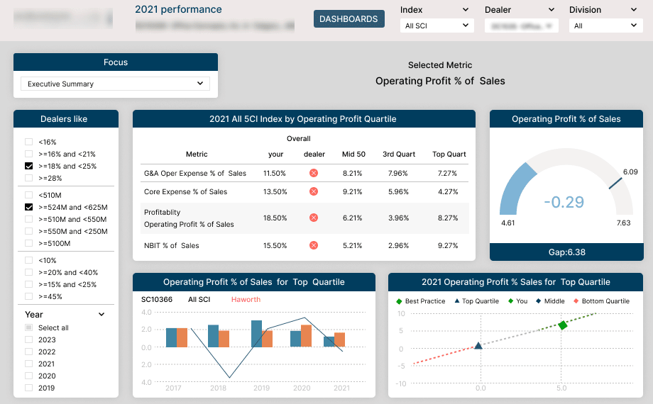
Assessing business performance:
Power BI dashboards have many purposes in organizations, the primary being monitoring and assessing business performance. Dashboards are a robust tech tool that helps managers and executives to glide through data and make sound business profiting decisions rather than relying on instincts.
Visual Presentation of Data Analytics:
Dashboards are also helpful in presenting the work of data analytics in a visually appealing format to understand KPIs and other important information for making efficient decisions.
Versatility of Power BI:
Power BI is a star of all data visualization tools as it provides a ton of dashboard creation and customization options for companies to meet their goals.
A business has many aspects, different departments, and projects needing constant inspection. Also, in the rapidly changing technological landscape, dashboard’ features must be aligned with business needs, market, and customers’ demands.
Our team of Power BI experts understand the importance of business intelligence and data analytics in modern markets. That is why we have listed down the 18 best Power BI dashboards.
We breakdown of the different metrics dashboards represent features and how they can be helpful to drive key insights. Don’t miss them!
Now let’s get into the best Power BI dashboard examples and dashboard templates!
Top 18 Power BI Dashboard Examples

Check out 18 amazing Power BI dashboards examples we’ve picked for you! These dashboards are designed to help you make smart decisions in different areas of business. They show how Power BI can turn raw data into useful insights.
Whether you’re looking at executive insights or customer satisfaction reports, these dashboards are made to fit different industries and needs. They give you a complete view of important data and trends.
Take a closer look at these examples to see how Power BI can change the way you evaluate data and plan for the future of your organization.
1. Business Information Dashboard:
The first Power BI KPI dashboard example is The business information dashboard. It is designed to assist decision-makers in making more informed decisions about workflow and process flows. It provides a comprehensive visualization of emerging trends and anticipated business actions, offering insights into the company’s financial, technical, and operational features.
Insights Provided:
- Identification of New Trends: The dashboard enables decision-makers to identify new trends within the company’s data, allowing for proactive decision-making.
- Anticipation of Business Actions: The dashboard’s insights allow decision-makers to predict future business actions, enabling strategic planning and resource allocation.
What the Dashboard Offers:
- Data Retrieval Optimization: The dashboard addresses core challenges such as slow data retrieval performance by leveraging a Lakehouse architecture. This includes building SQL views, optimizing queries, and implementing schema enforcement and indexing.
- Efficient Data Modeling: Customized and functional data models are developed to meet specific business requirements, with careful consideration given to schema selection and date filtering optimization.
- Real-Time Data Analysis: Utilizing the direct query mode, the dashboard allows for real-time analysis of data stored in the Lakehouse, eliminating the need for data duplication or caching.
What People Love About this Dashboard:
- Centralized Data Management: The Lakehouse structure helps businesses manage all their data in one place, making it easy to access and analyze.
- Drag-and-Drop Functionality: Users appreciate the ease of reorganizing visualizations using drag-and-drop functionality, allowing for customizable layouts without compromising data integrity.
- Embedded Reports: The dashboard’s integration with Power BI Embedded enables businesses to seamlessly incorporate interactive dashboards and reports into their own applications, providing customers with comprehensive data analytics within their preferred environment.
2. Shipping Industry Business Intelligence Dashboard:
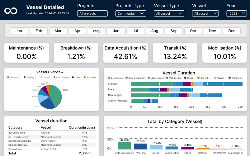
In the list of power BI dashboard examples, we have the Shipping industry BI dashboard. The shipping industry dashboard is a special tool that helps professionals make better decisions and improve how shipping works. It uses visual data and analysis to show complex information in an easy way.
Insights Provided:
- Data Integration: The dashboard offers insights into data integration challenges, such as managing vast amounts of historical data and optimizing API data management through incremental refresh mechanisms.
- Real-Time Data Processing: Professionals gain insights into real-time monitoring for vessel planning, route optimization, and cargo handling, facilitated by aggregated data pipelines and efficient queries.
- Predictive Analytics: Insights are provided into predictive analytics, including vessel performance prediction, maintenance requirements, fuel consumption forecasting, and arrival time estimation using line chart forecasting features. A Power BI specialist can help you leverage these predictive analytics capabilities to gain deeper insights and optimize your operations
- Regulatory Compliance: The dashboard provides insights into regulatory compliance metrics, ensuring that the shipping industry follows security, confidentiality, emissions, and environmental protection regulations.
- Data Security and Privacy: Professionals gain insights into data security measures, such as Row Level Security (RLS), ensuring the confidentiality and protection of sensitive data based on specific criteria.
What the Dashboard Offers:
- Tailored Visualization: The dashboard is tailored specifically for the shipping industry, providing a range of versatile charts curated to visually represent shipping data with enhanced clarity.
- Efficient Data Management: Users benefit from efficient data management, including data integration with incremental refresh mechanisms to balance timeliness and stability.
- Predictive Analysis Features: Sophisticated predictive analysis forecasts ship performance, maintenance needs, fuel consumption, and arrival times. This aids shipping firms in boosting efficiency and reducing costs
- Regulatory Compliance Tracking: Power BI reports contain metrics to track compliance with regulations and guarantee compliance with industry standards. Working with a Power BI consultant can enhance your ability to effectively use these reports to ensure adherence to regulatory requirements.
- Improved Data Security: Security protocols like Row Level Security (RLS) protect sensitive data based on specific criteria, guaranteeing confidentiality and information security.
What People Love About this Dashboard:
- Industry Focus: Users appreciate how the dashboard focuses on their specific industry, providing insights and solutions tailored to the shipping sector.
- Actionable Insights: Users find the dashboard valuable because it gives them practical insights that help them make informed decisions and improve how they work.
- Easy to Use: People like how the dashboard is designed—it’s simple to use and helps them understand complex data easily.
- Compliance: Users are happy to see that the dashboard includes metrics to ensure they follow industry rules. This helps them avoid problems with compliance.
- Security: The dashboard’s strong security measures, like Row Level Security (RLS), make users feel safe about their data’s privacy and protection.
3. Office Furniture Makers Business Intelligence Dashboard:
In the list of power BI dashboard examples, we have BI dashboard for office furniture makers. The dashboard helps office furniture makers’ executives make smart decisions and increase revenue. It’s easy to use and gives them important info, like trends and performance, so they can respond quickly to market changes.
Insights Provided:
- Legacy System Replacement: The dashboard addresses challenges associated with transitioning from legacy systems, such as SSRS, to Power BI, facilitating dynamic, interactive, and data-driven reporting and analysis.
- Data Retrieval Optimization: Insights are provided into resolving issues with slow data retrieval from SQL databases by leveraging AAS cubes, resulting in faster data processing and improved efficiency.
- Data Modeling: The dashboard implements strong data modeling techniques within Power BI, ensuring optimal analysis and visualization capabilities to support informed decision-making.
- Automated Processes: Users gain insights into the benefits of replacing manual processes with automated ones, including decreased errors, saved time, increased productivity, and superior outcomes.
- DAX Optimization: The effectiveness of Data Analysis Expressions (DAX) is optimized to expedite data processing and enhance overall performance.
What the Dashboard Offers:
- Centralized Data Management: The dashboard centralizes all data using AAS structure, simplifying corporate management and providing executives with easy access to essential information.
- Better-Looking Visuals: We make our charts and graphs more attractive and informative with personalized gauges. This helps users understand important metrics and how things are going.
- Reports Inside Apps: Using Power BI Embedded, we can put our cool charts and graphs right into our websites or apps. This lets customers see and play with the data without leaving the app, making things easier for them.
What People Love About this Dashboard:
- Smart Choices: People like that the dashboard gives them helpful info, so they can make smart decisions and plan ahead.
- Easy to Use: The dashboard is simple to use, which makes it easy for clients to find what they need and spot trends. It makes things smoother for everyone.
- Getting More Done: By automating tasks and making data work faster, the dashboard helps office furniture makers work better and get better results.
- Visual Appeal: Enhanced visuals and personalized gauges improve the visual appeal of the dashboard, making it easier for executives to interpret key metrics and performance indicators.
- Integration Capabilities: The ability to embed reports into websites or applications allows for seamless integration with existing systems, providing customers with convenient access to essential data.
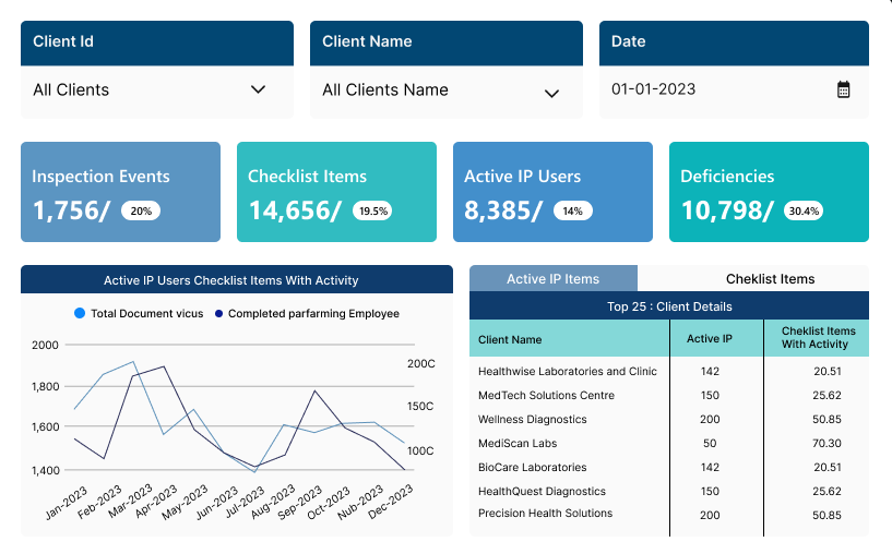
4. Revenue Cycle Management Solutions Dashboard:
Here’s the next in the list of Power BI dashboard examples! The Revenue Cycle Management Solutions Dashboard serves as a center of excellence supporting the delivery and enhancement of capabilities for providers and payors. It encompasses services such as Patient Access, Coding, and Accounts Receivable, providing a comprehensive solution for payors. Through end-to-end, integrated pre- and post-adjudication workflow tools, the dashboard transforms data into actionable information, significantly enhancing quality, profitability, and customer service.
Insights Provided:
- Data Modeling with Power BI Dataflow: Leveraging Dataflow, the dashboard directly loads data from the server into the cloud, overcoming challenges associated with providing access via SSH tunnel/VPN and ensuring seamless data integration and accessibility.
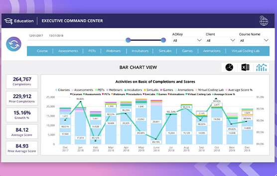
- Education Command Center: An overview dashboard presents trends in activities within selected date ranges, offering insights into various entities and their performance.
- Usage Detail: A detailed view of activities/course names over time provides insights into historical values and growth percentages, aiding in performance evaluation and strategic decision-making.
- Client Details: Detailed insights into client behavior over time allow for the identification of top and bottom clients, enabling tailored service delivery and improved client management.
- Comparison Analysis: A comparative view between different aspects of data facilitates informed decision-making by comparing trends based on different date filters and predicting future outcomes.
- Client Size Analysis: This page compares entities based on size attributes, such as large, medium, and small clients, offering insights into their behavior and preferences.
- Answer Level Details: Analyzing the behavior of courses/activities helps identify trends in incorrect attempts and correct answers, allowing for course optimization and improvement to enhance learning outcomes.
What the Dashboard Offers:
- Full Picture: The dashboard shows everything about revenue cycle management, so everyone can see how things are going and find ways to make them better.
- Deep Look: It gives lots of details about what clients do, how they use things, and how courses are doing. This helps customize services and make smart decisions.
- Compare and Decide: Comparing different parts of the data helps set standards and see trends, which helps make decisions based on what the data says.
- Optimization Opportunities: Insights into incorrect attempts and answer details enable course optimization and improvement, enhancing learning outcomes and customer satisfaction.
What People Love About this Dashboard:
- Useful Guidance: People like how the dashboard gives them practical advice, so they can make smart choices and make things better.
- Simple to Use: The easy-to-use layout helps everyone move around the dashboard and find important information, making it work better for everyone.
- Make it Your Own: The dashboard lets users change things around to fit what they need and like, making it more personal and useful.
- Improving Results: People see how the dashboard helps make things better in terms of quality, making money, and keeping customers happy by using data and finding ways to do things better.
5. Patient Financial Experience Dashboard:
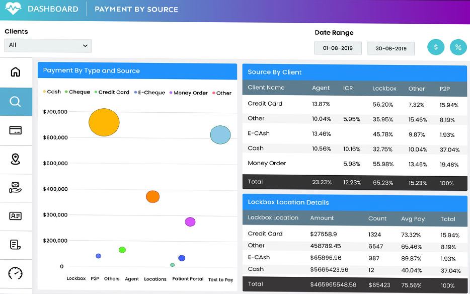
It is one of the best Power BI dashboard examples for healthcare companies. The Patient Financial Experience Dashboard simplifies and streamlines the patient financial journey by fostering early, informative, and frequent communication with patients. Leveraging a proven patient engagement platform and a team of highly-trained support specialists, the dashboard enhances patient understanding and engagement throughout the financial process.
Insights Provided:
- Database Replication and Connection: The dashboard is powered by a production database replicated in SQL Server and connected through a VMware Client with Power BI Desktop installed. This setup centralizes data and enables seamless connectivity for streamlined reporting and analysis.
- Consolidated Operational Pulse: An overview BI app offers segmentations of the business, including payment, placements, statements, call time, status, aging, and more. It provides insights into different trends within these entities across various date ranges, facilitating comprehensive analysis of operational performance.
- Agent Scoreboard: A detailed view of daily activity provides Agent Performance Information displayed in a leaderboard format. This gamified dashboard motivates agents by allowing them to see and compete with top performers on a daily basis, enhancing productivity and performance.
- Key Metric Alert: An overview of different segmentations such as payments, placements, statements, and calls over time identifies top movers and losers with their usage behavior. It offers prior period calculations and daily averages to visualize client trends effectively.
What the Dashboard Offers:
- Better Communication: The dashboard makes it easier to talk to patients early, giving them helpful information often, which helps them understand and get involved in financial matters.
- Easier Reporting: Having all the data in one place and simplifying how reports are made helps analyze how things are going and the important numbers, which helps make better decisions.
- Agent Performance Tracking: The Agent Scoreboard helps agents see how well they’re doing compared to others in real-time, which makes them want to do better and helps them work faster.
- Spotting Trends: Key Metric Alert shows trends in how clients are using things, which helps find areas to improve and make smarter decisions for the future.
What People Love About this Dashboard:
- Improved Patient Engagement: Users appreciate how the dashboard enhances patient understanding and engagement through early and informative communication, leading to a better overall patient financial experience.
- Agent Engagement: Agents enjoy the competitive nature of the Agent Scoreboard, which encourages them to work harder and improve their performance.
- Detailed Analytics: Users like how the dashboard gives them a lot of information, helping them keep an eye on how things are going and make smart decisions for the future.
6. Sales Projection and Demand Trends Dashboard:
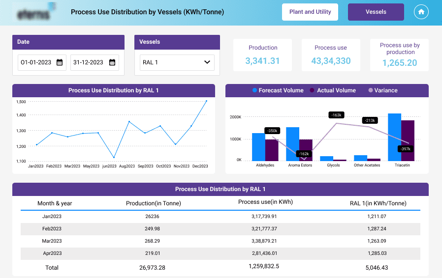
Next in the list of Power BI dashboard examples! The Power BI dashboard for the chemical manufacturing sector offers detailed insights into sales results, productivity, and energy consumption, particularly in relation to steam vessels. Sales managers in the industry can leverage this dashboard to monitor key metrics such as production output, sales projection, and demand trends, facilitating both operational efficiency and strategic decision-making.
Insights Provided:
- Unified Data Model: The dashboard consolidates data from various sources including SharePoint folders, lists, CSV files, OneDrive, and Excel spreadsheets into a unified data model, enabling a comprehensive view of operations across different processes.
- Complex Data Analysis: With data involving complex relationships and multiple analyses, the dashboard effectively visualizes intricate data structures in a user-friendly manner, facilitating understanding of factors impacting production efficiency, quality, and safety.
- Predictive Analytics: Customized forecasting measures enable accurate sales predictions, providing insights into inventory management and stock levels, crucial for planning and resource allocation.
- Data Security and Privacy: Robust data security measures, including role-based access control within Power BI, safeguard sensitive information related to product formulation and other confidential data within the chemical manufacturing industry.
- Segmentation: The dashboard segments data across various plants and vessels, distributing production and energy consumption for detailed analysis and operational insights.
What the Dashboard Offers:
- Comprehensive Analytics: The dashboard provides sophisticated analytics using production and energy distribution data, offering a deeper understanding of operational dynamics and asset performance.
- Thorough Insights: Specific energy distribution tabs for oil and steam plants enhance operational insights, allowing professionals to monitor and optimize asset performance effectively.
- Enhanced User Experience: User interface enhancements, including redesigned UI/UX elements and top navigation, improve usability and accessibility, ensuring a seamless experience for users.
- Drag and Drop Functionality: Energy distribution pages for oil and steam plants and vessels are created using drag-and-drop functionality, enabling easy reorganization of visualizations while maintaining layout consistency.
- Embedded Reports: Interactive Power BI dashboards and reports can be seamlessly integrated into custom websites, client portals, or applications using Power BI Embedded, providing customers with access to comprehensive, interactive data analytics within familiar environments.
What People Love About this Dashboard:
- Streamlined Operations: sales managers appreciate how the dashboard streamlines operations by providing comprehensive insights into sales data, productivity, and energy consumption, enabling informed decision-making and resource optimization.
- Safety Guarantee: People like that their data is well-protected in the chemical manufacturing sector, ensuring it stays private and secure.
- Better User Experience: The dashboard’s new look and easy-to-use tools make it easier for users to check out and use the data, making them happier with how it works.
7. Interactive What-If Analysis Dashboard:
Next, we have Power BI dashboard examples for what-if analysis. The What-If Analysis Dashboard lets users play around with different scenarios, helping them understand complex data better. By using cool visual tricks and bringing in lots of different data sources, this project has made things a lot better for people working in the car industry.
Insights Provided:
- Playing with “what-if” scenarios: People can change stuff like costs and profit margins to see how it affects things, helping them make smart choices.
- All-in-one Reporting: The dashboard puts everything in one place, making sure new stuff fits right in and everything looks nice and neat.
- Enhanced Data Filtering: Sophisticated data filtering tools allow users to extract precise insights from diverse data sets, enhancing data representation and analysis for different sectors and fields within the automotive industry.
- Improved Functionality: The dashboard features dynamic modifications and smooth filtering analysis, enhancing adaptability and flexibility in the reporting system while ensuring data consistency and integrity.
- Modular Dashboard Elements: Visualization elements such as cards and boxes provide users with instant access to key indices and understandable information, enhancing data interpretation and decision-making.
- Data Visualization: Aesthetically pleasing and well-organized tabular data representation, including conditional formatting and additional metrics, columns, and charts, expands the scope and depth of data analysis capabilities. For expert guidance in achieving such enhancements, data visualization consulting can provide valuable insights and strategies.
What the Dashboard Offers:
- Real-Time Scenario Simulation: Users can conduct dynamic “what-if” analyses by adjusting parameters and exploring potential outcomes in real-time.
- Unified Reporting Environment: The dashboard offers a seamless and cohesive reporting environment by synchronizing newly introduced parameters and components across the platform.
- Sophisticated Data Filtering: Advanced filtering tools enable users to extract precise insights from diverse data sets, enhancing data representation and analysis for different sectors within the automotive industry.
- Enhanced Functionality: Dynamic modifications and smooth filtering analysis improve adaptability and flexibility in the reporting system while ensuring data consistency and integrity.
- Building Blocks for Easy Understanding: The dashboard has blocks that show important stuff, making it easy to understand and make decisions.
- Reports Inside Apps: The dashboard is put right into web apps, so people can use it without switching between different programs.
What People Love About this Dashboard:
- Dynamic What-If Analysis: Users appreciate the ability to conduct dynamic “what-if” analyses, enabling them to explore potential scenarios and make informed decisions.
- Unified Reporting Environment: The seamless integration of parameters and components across the dashboard enhances user experience and ensures data consistency.
- Sophisticated Data Filtering: Advanced filtering tools allow users to extract precise insights, improving data representation and analysis.
- Enhanced Functionality: Dynamic modifications and smooth filtering analysis enhance adaptability and flexibility in the reporting system, improving overall usability.
- Modular Visualization Elements: Users value the modular visualization elements for providing instant access to key indices and understandable information, facilitating data interpretation.
8. Client Data Accuracy Dashboard:
Another is in the list of Power BI dashboard examples for healthcare. The Client Data Accuracy Dashboard makes sure all patient data, from before they arrive to after they leave the hospital, is correct and complete. With Power BI, healthcare businesses can use their data to make smart decisions and grow.
Insights Provided:
- Unified Data Integration: The dashboard addresses challenges related to diverse data formats by integrating data from various sources such as SQL Server, MySQL Server, Excel, and CSV files. SSIS packages and Visual Studio are utilized for data consolidation, ensuring a seamless integration process.
- Live Connected Data: Real-time data connectivity with SSAS tabular cubes is facilitated through the use of tools like Tabular Editor, enabling efficient creation, analysis, and editing of DAX measures for accurate data interpretation.
- Data Privacy and Security: To safeguard sensitive information, the dashboard implements row-level security features, demonstrating a commitment to data privacy and security.
- Predictive Analysis: Predictive analysis is enabled through the Forecast feature, allowing healthcare professionals to interpret prediction models and make informed decisions based on historical data.
What the Dashboard Offers:
- Streamlined Workflows: By automating repetitive tasks and streamlining data workflows, the dashboard optimizes operational processes, reduces manual errors, and enhances overall efficiency.
- External Tools Integration: Third-party tools such as Tabular Editor, ALM Toolkit, and DAX Studio are integrated into Power BI Reports, enabling quick edits, improved data modeling, and accelerated development processes.
- Time Intelligence: Time Intelligence DAX measures are applied using Tabular Editor to optimize performance and manage dataset size effectively.
- Customized Dashboards and Reports: Reports and dashboards are tailored to meet unique needs, offering user-friendly visualizations for data-driven decision-making at all levels.
- Data Modeling Optimization: Simple data models with appropriate relationships and cross-filter settings optimize data for improved performance and accuracy.
- Embedded Analytics: Reports are embedded into the portal for enhanced accessibility, providing users with a simplified way to access relevant reports and data information.
What People Love About this Dashboard:
- Data Accuracy Confidence: Users like how the dashboard ensures data is accurate at every step of a patient’s journey, making decision-making more reliable.
- Efficient Workflows: Automating tasks and streamlining workflows saves time and reduces mistakes, making operations run smoother.
- Predictive Analysis Tools: The dashboard’s ability to predict future trends using past data helps healthcare professionals plan ahead and make proactive choices.
- Tailored Reports: Users appreciate being able to customize reports to fit their needs, giving them more control and flexibility in analyzing data.
9. Food and Beverage Management Dashboard:
It is one of the best Power BI dashboard examples for businesses in the food industry. The Food and Beverage Management Dashboard keeps an eye on important stuff in the industry like sales, inventory, what customers like, and how things move in the supply chain. It watches numbers like sales money, how fast inventory moves, how happy customers are, and how suppliers are doing. This helps decision-makers make smart choices and improve how the business works.
Insights Provided:
- Data Variety Management: Food and beverage companies deal with diverse data types, including sales data, production data, supply chain information, customer feedback, and regulatory compliance data. The dashboard utilizes Power Query Editor to transform and cleanse raw data from various sources before loading it into Power BI datasets.
- Supply Chain Complexity: The complex food supply chain involves multiple stages from sourcing raw materials to retail. Data pipelines are implemented to automate the extraction, transformation, and loading (ETL) of supply chain data into Power BI datasets regularly.
- Seasonal Demand Forecasting: Seasonal fluctuations in demand are addressed through predictive logic within Power BI, forecasting future demand based on historical trends and external factors.
- Market Trends Analysis: Integration of market research data and competitor analysis enables the identification of emerging trends and consumer preferences, helping businesses stay competitive.
- Customer Engagement: Personalized marketing campaigns based on insights derived from customer data analysis within Power BI drive customer engagement and loyalty.
- Data Quality Enhancement: Data profiling and cleansing capabilities in Power BI standardize data formats, remove duplicates, and enhance data quality for accurate analysis.
- Adaptable Headings and Data Values: Dynamic changes in headings and data values based on filtering actions are handled effectively through measures implemented in Power BI.
What the Dashboard Offers:
- Smart Data Pictures: The dashboard shows data in smart ways made just for the food and beverage world, making it easier to understand complex information.
- Instant Alerts: The dashboard quickly points out any quality issues so they can be fixed right away.
- Guessing Future Demand: The dashboard tries to predict how much people will want certain foods or drinks in the future, using things like holidays and weather forecasts.
- Reports Inside: Reports are put right into web apps, making them easy to get to and fit right into how people work, making them easier to use.
What People Love About this Dashboard:
- Comprehensive Insights: Users appreciate the comprehensive insights provided by the dashboard, covering various aspects of the food and beverage industry in one centralized platform.
- Instant Warnings: Get alerts right away to fix problems quickly, keeping things running smoothly and making sure everything’s up to scratch.
- Future Guessing: Predict what people might want in the future and stay ahead of the game by looking at past trends and market changes.
- Reports Inside: Reports are built into the system, making them easy to find and use as part of your regular work.
10. Executive insights by decisive data
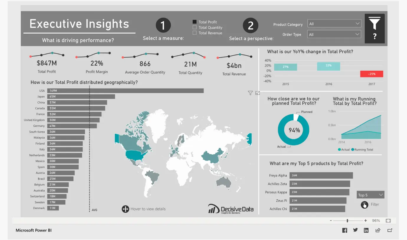
Source: Microsoft Community
Next in the list of Power BI dashboard examples, we have the executive insights dashboard. The executive insights dashboard gives a clear picture of the critical data about products, profits, and location. Executives can quickly make decisions during a meeting about
- Profit margins
- Supplies
- New Product launches, production
What this dashboard shows
- The top 5 products and their global sales
- Revenue generated in different countries
- How much profit goal has been achieved
- YoY% changes every year
What this dashboard offers
This dashboard is designed for global-minded companies to quickly answer “how are they performing.” Using dynamic visuals, this dashboard pushes for a user-flexible and interactive data session with a focus on multiple angles of business – total profit, total quantity, and total revenue. Each one of these particulars has a similar interface to provide ease of user familiarity.
Read Our Page : Offshore Software development Company
Total quantity
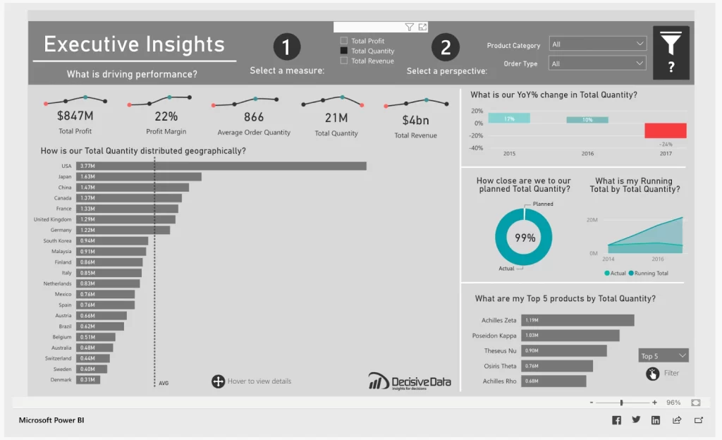
Source: Microsoft Community
Total revenue
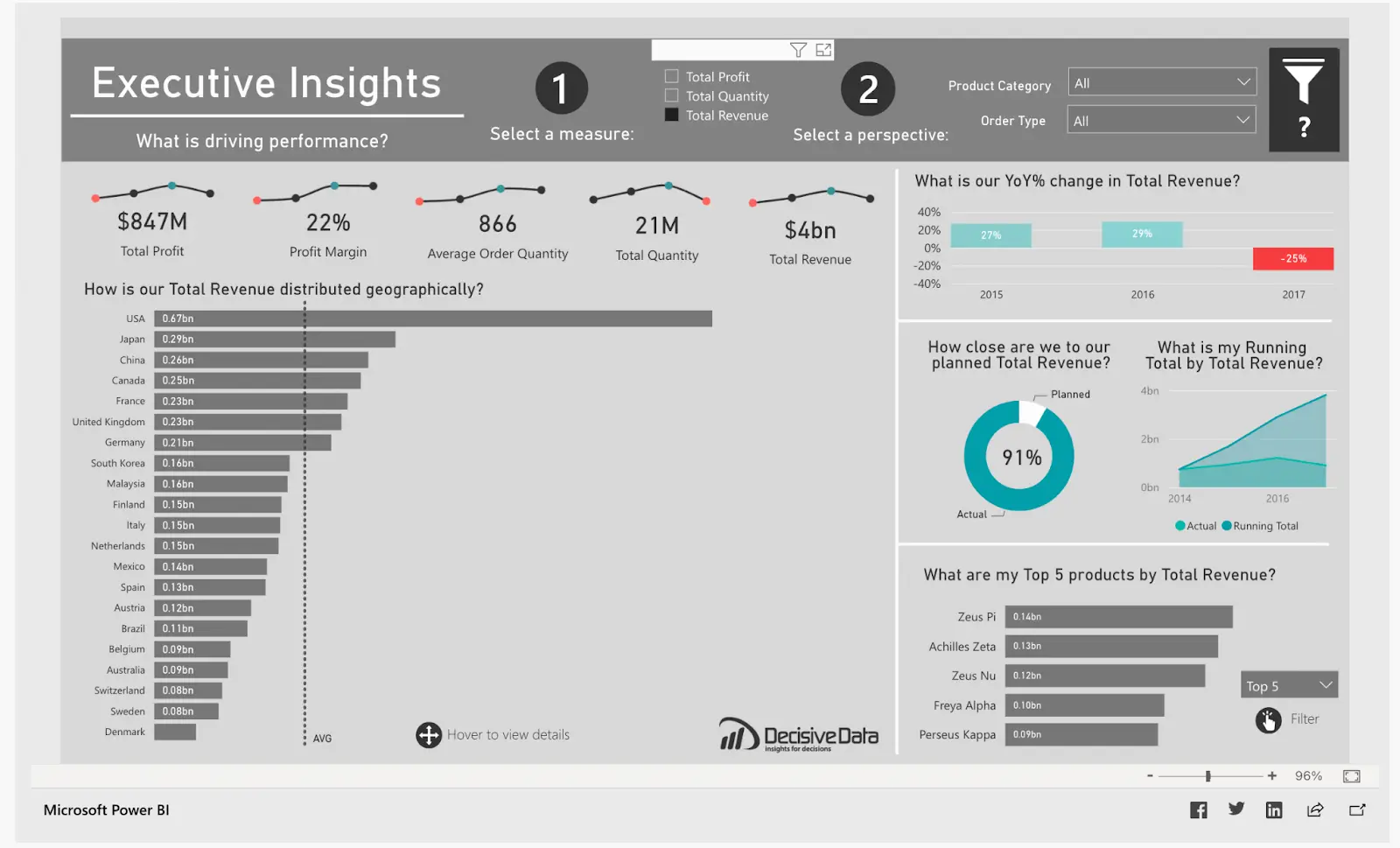
Source: Microsoft Community
One look at the dashboard tells all the important attributes of the company:
- What product are they selling?
- Which country are they selling it in?
- Which year are they selling it?
- How are they selling
What people love about this dashboard
This dashboard is a prime example of user interactivity, attractive mapping, and dynamic visuals. It gives users various statistics in one frame saving valuable real estate.
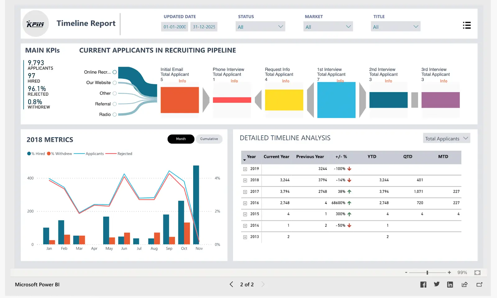
11. Recruiting pipeline report
In the list of Power BI dashboard examples, the next is for Human Resource management. The recruiting pipeline report is an excellent tool for the HR department of a business.
It provides deep insight into the recruiting process with four main KPIs –
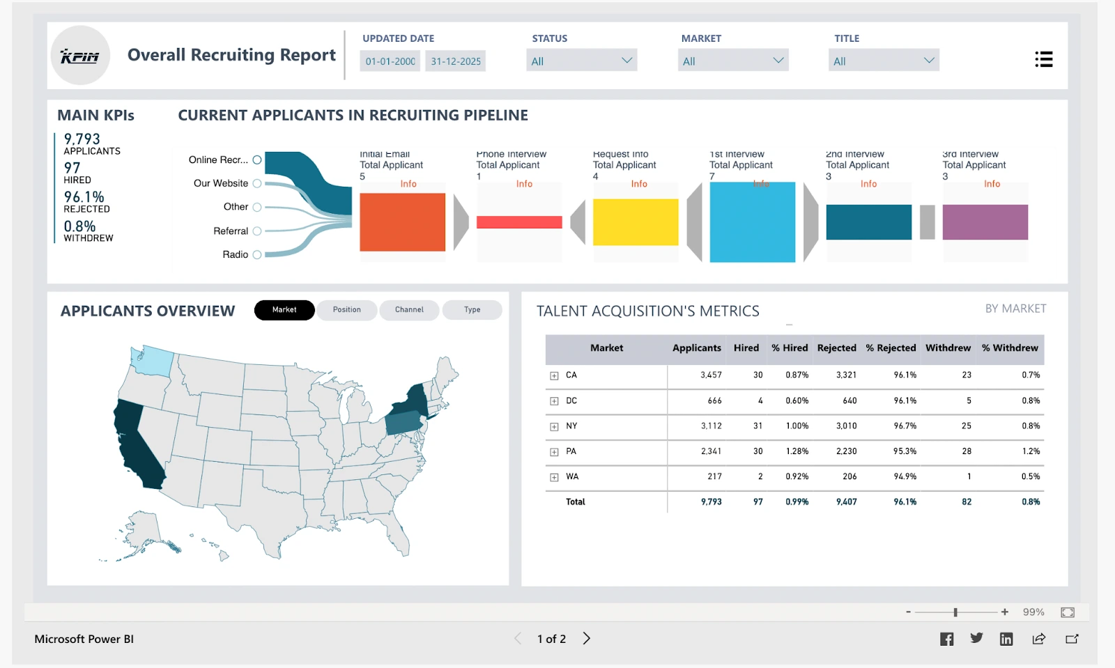
Source: Microsoft Community
- Total applicants
- Total hired
- Total rejected
- Withdrawal during the process
On the top of the dashboard, the pipeline visualization of every stage of the recruiting process along with the number of candidates in each makes it a piece of cake to evaluate for the hiring team. The sources of application are mentioned with the percentage of applicants through them.
Source: Microsoft Community
The next page of this dashboard has a detailed timeline analysis of recruitment statistics of the past years and a graph showing the recruitment metrics of every month in a single year.
What the dashboard offers
This dashboard is a simple visualization of all the possible data related to the recruitment process. The key insights the dashboard provides
- Summary of applicants in different phases of the pipeline
- Recruiting results of applicants using filters like location, sources, title, etc
- Monthly trend of total hired and rejected applicants
- Yearly hiring and rejection numbers

What people love about this dashboard
The applications of this recruitment pipeline dashboard go beyond analyzing the number of applicants. It can help HR managers to
- Monitor the recruiting process as a whole
- Analyze hiring trends over the years and in a single year
- The effectiveness of the hiring process
- Hiring based on title, sex ratio, amount of experience
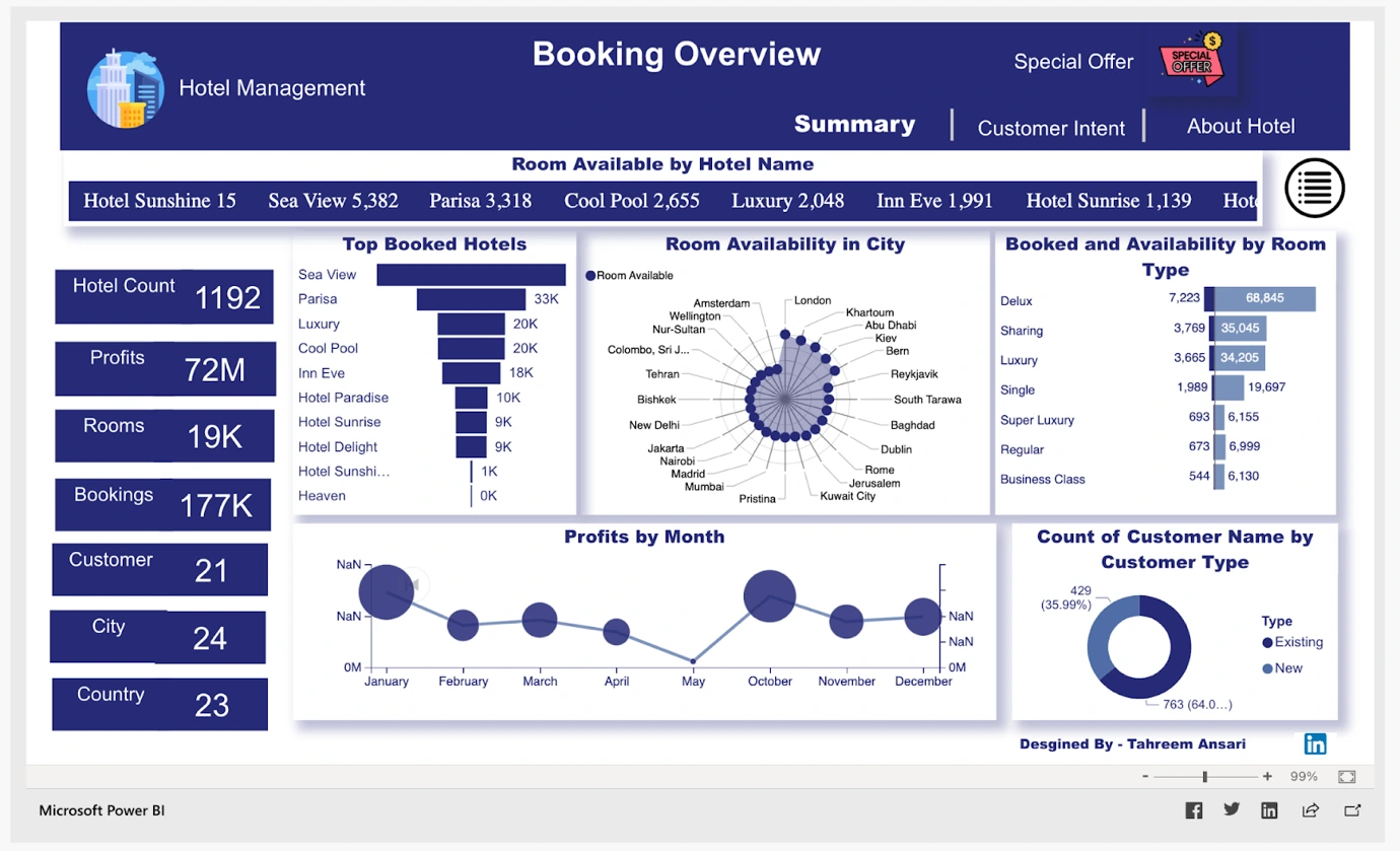
12. Hotel management dashboard
Source: Microsoft Community
It is one of the best Power BI dashboard examples for hotel management. It’s a beautiful looking dashboard with 12 stats on a single screen. The hotel management dashboard can help hospitality staff to see –
- Top booked hotels
- Room availability in different cities
- Room availability and booking of different types
- Total hotels
- Profits
- Total no. of rooms
- Bookings
- Profits sorted by month.
- Customer type
The dashboard has clean visuals that offer hotel staff the liberty to evaluate all attributes of hotels and guests. It empowers users with interactivity and investigates data on their own terms.
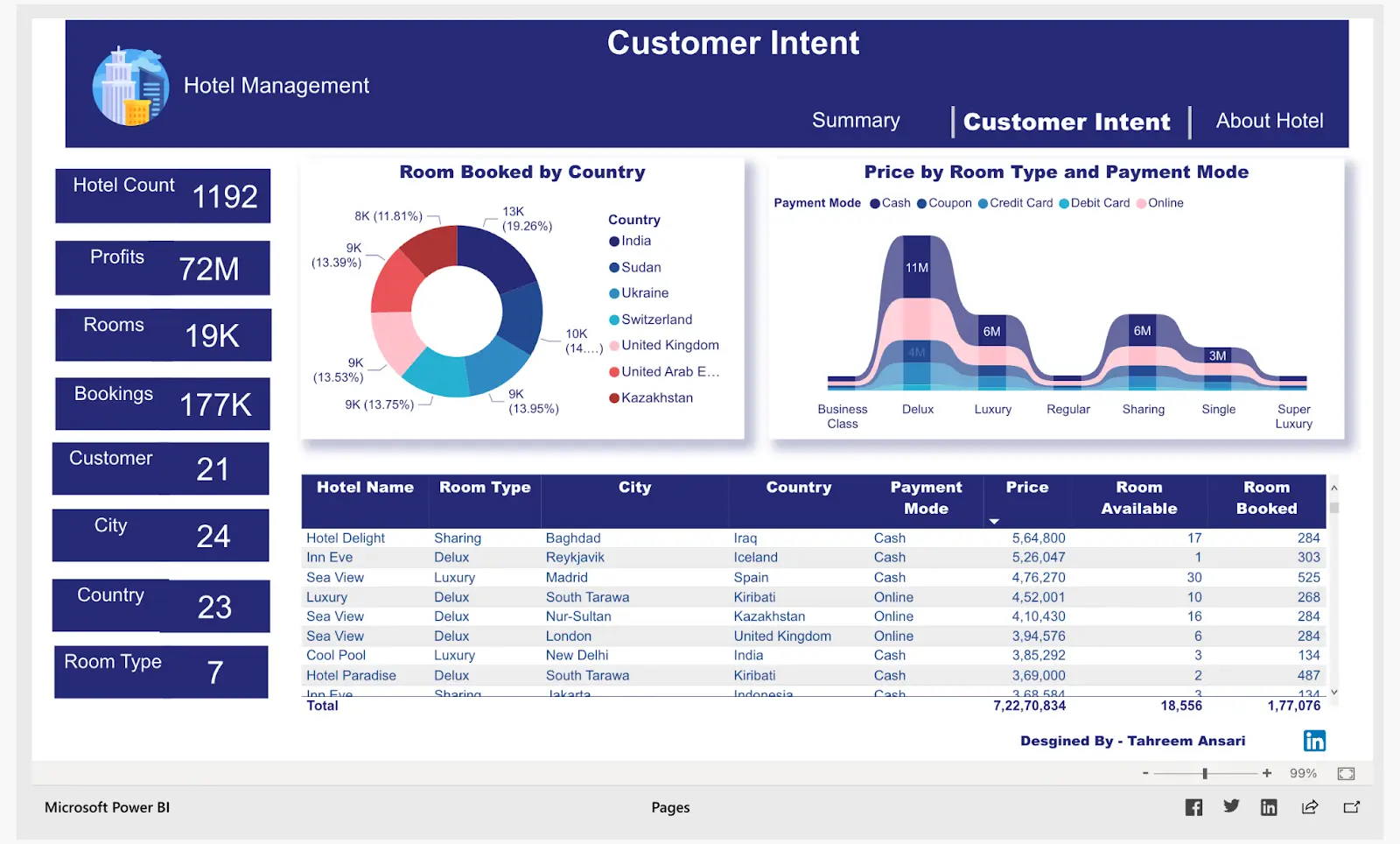
Source: Microsoft Community
The customer intent page has a circular chart showing the percentage of rooms booked in different countries. It also has a table with customer bookings, hotel names, room types, rooms booked, and more.
What the dashboard offers
A hotel management dashboard is meant to help hotel managers and staff to operate through data-driven decisions. Instead of looking over a dozen pie charts, graphs, and tables, one dashboard for all statistics is far more efficient. It has
- Percentage of rooms booked by countries
- Price of room and payment mode
- Total no. of hotels, rooms, bookings
- Most booked hotels with prices
- Type of room available
- Profits by month
What people love about this dashboard
To get a complete overview of the hotel metrics on one single screen, this dashboard is perfect. It helps owners to visualize the main KPIs of bookings, rooms, and hotel performance over time. It can assist stakeholders and staff to
- Keep an eye on occupancy.
- Improve day-to-day operations
- Check targets
- Segment data for business reports
- Filter and drill into information with one dashboard
13. Global oil production and consumption
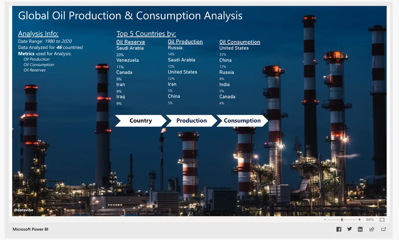
Source: Microsoft Community
The next example is in the list of Power BI dashboard examples. This Power BI dashboard gathers the key metrics of oil production and consumption globally to make it easy for employees to analyze vast amounts of data in real time. The dashboard here shows the top 5 countries with the most oil
- Reserve
- Production
- Consumption
Oil and gas industry faces the challenge of Big data visualization to track critical parameters, production numbers, costs, etc. Power BI dashboards offer a refreshing visual solution for the entire industry worldwide.
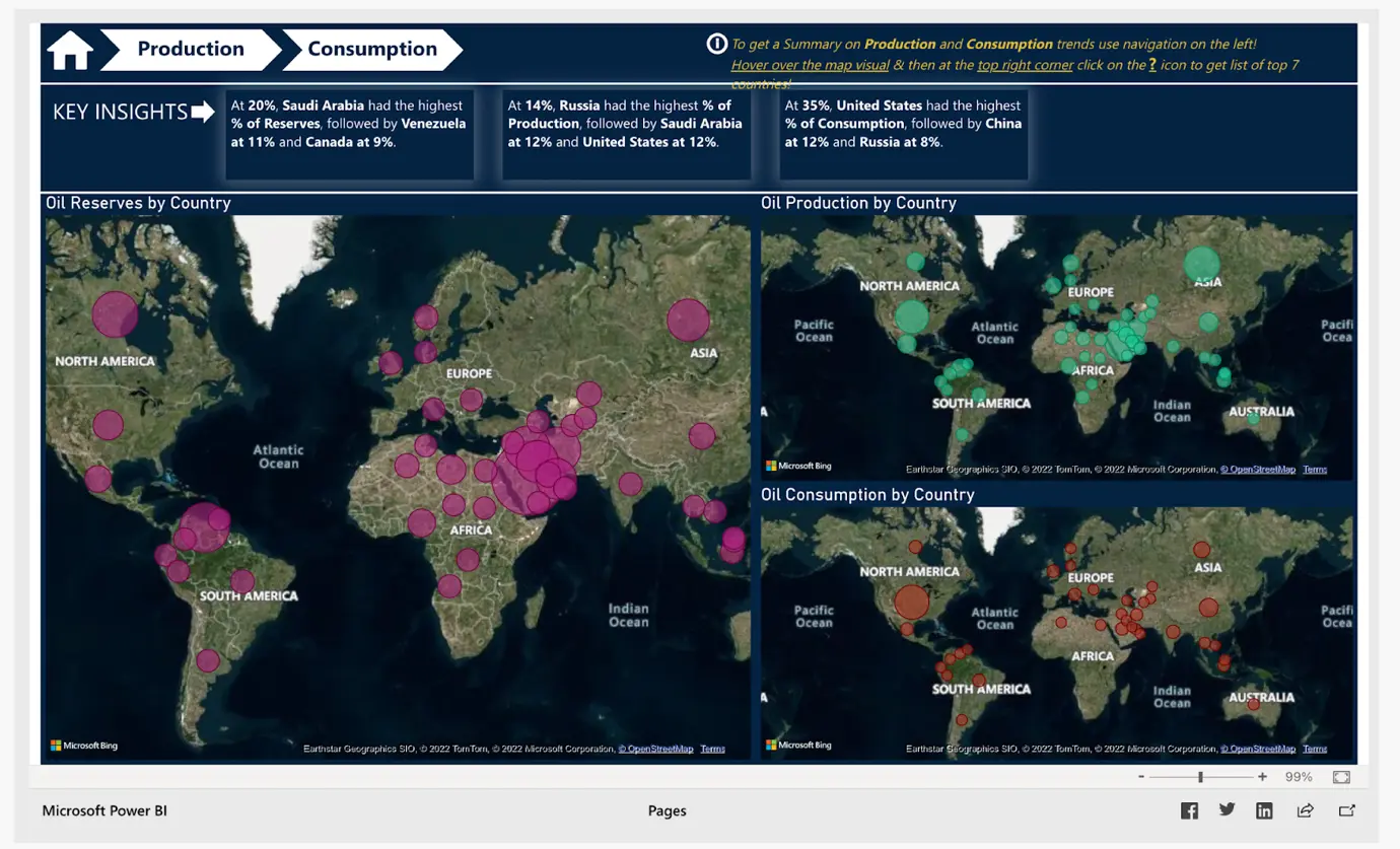
Source: Microsoft Community
The country tab of this dashboard reveals the key insights about the top 3 oil metrics – reserve, production, and consumption of all countries. It can help employees to make data-backed decisions with critical information and also
- Track production of oil in different countries
- Total production in the last few months
- Oil consumption by countries
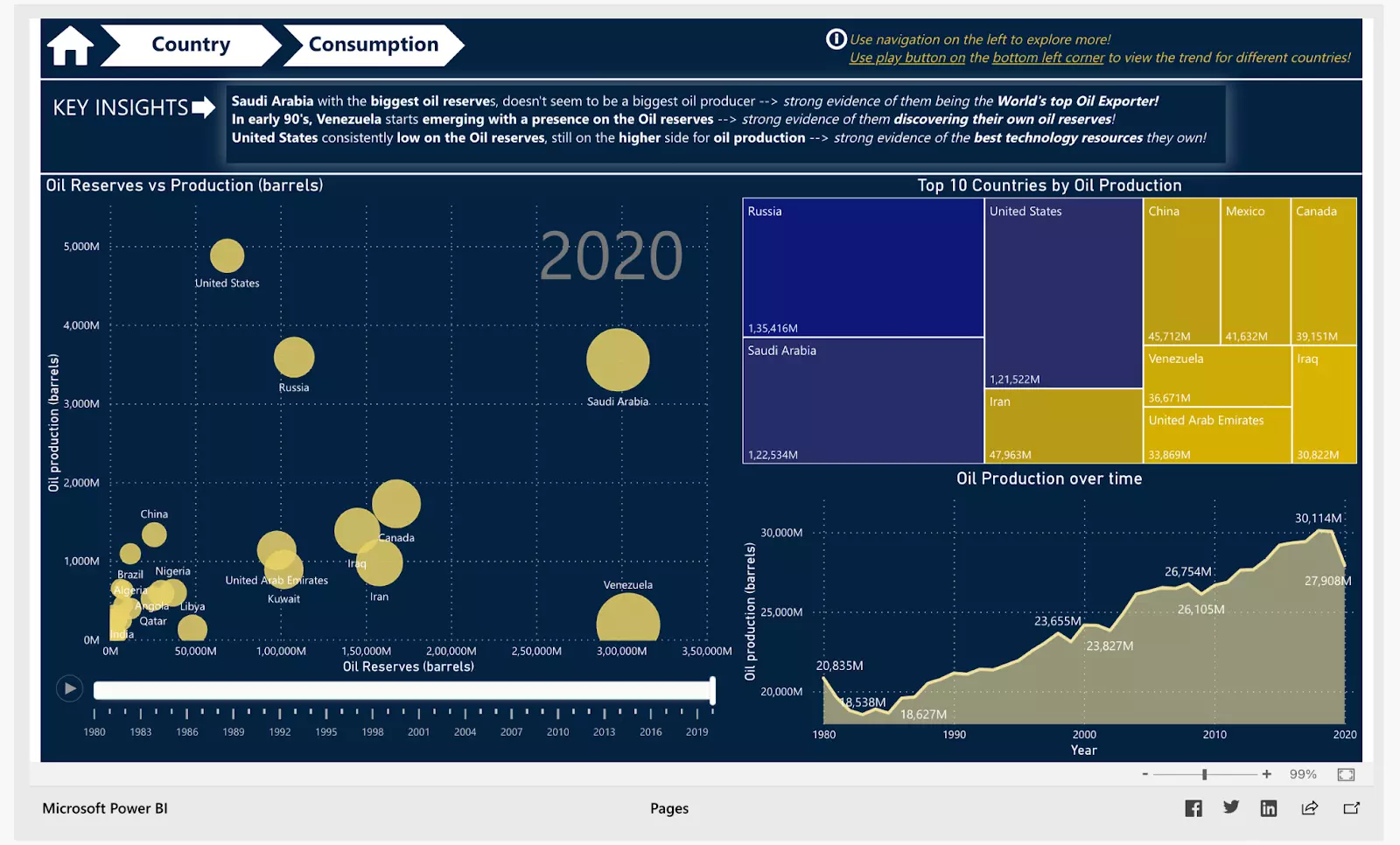
Source: Microsoft Community
The production tab of this O&G dashboard shows
- The Biggest oil reserves countries
- The total production in each year by countries
- The complete oil production timeline
The third tab is about oil consumption figures around the world. It provides key insights into the key performance indicators (KPIs), including –
- Top 10 countries in oil consumption
- Oil consumption timeline from 1960
- Oil consumption and production of different countries
What this dashboard offers
The global oil production and consumption dashboard is a cumulation of statistics for top 3 metrics of the O&G industry. Oil is a scarce resource in our world that is why efficiently managing its reserves is a top priority and a challenge as well.
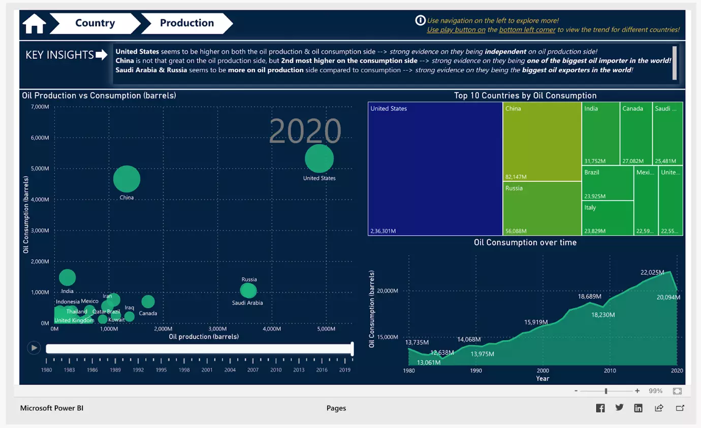
Source: Microsoft Community
But power BI dashboard development like this can overcome this challenge with accurate and real-time data. Furthermore, it can help with
- Monitoring production and consumption KPIs
- Integrated visualizations
- Tracking oil reserves worldwide
- Deep analysis for production maximization opportunities
What people love about this dashboard
This Microsoft Power BI dashboard gives oil business management the power of business intelligence and data analytics. It increases oil production efficiency across all plants for a company as per their requirements. Additionally, Power BI development services can further enhance these capabilities to meet specific business needs and optimize overall performance. –
- Easy data analysis for users with little or no DA experience
- Insightful dashboard for analysis and reporting
- Real-time data information to assist in critical decision making
14. Customer satisfaction report dashboard
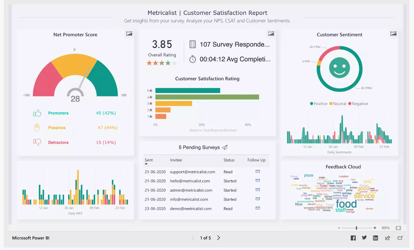
Source: Microsoft Community
If you want to see if your customers are happy or not, this is one of the best Power BI dashboard examples. This customer satisfaction dashboard is designed to charge a company’s survey analytics. It enables business and marketing managers to perform end-to-end analysis of complete survey data without data scientists. Power BI developers can help tailor these dashboards to meet your specific needs and enhance your data analysis capabilities. The power BI dashboard includes –
- Net promoter score indicator
- Customer sentiment chart
- CSAT analysis
- Overall rating and surveys taken
The other pages of this dashboard have more detailed statistics and graphs of CSAT and NPS. Let’s look at the CSAT page first.
This power BI template of customer satisfaction report gets insights from surveys for data analytics. It can help business owners and marketing managers to
- Customer response across the region, gender, and age group
- Identify customer satisfaction scores in different segments
- Schedule upcoming surveys
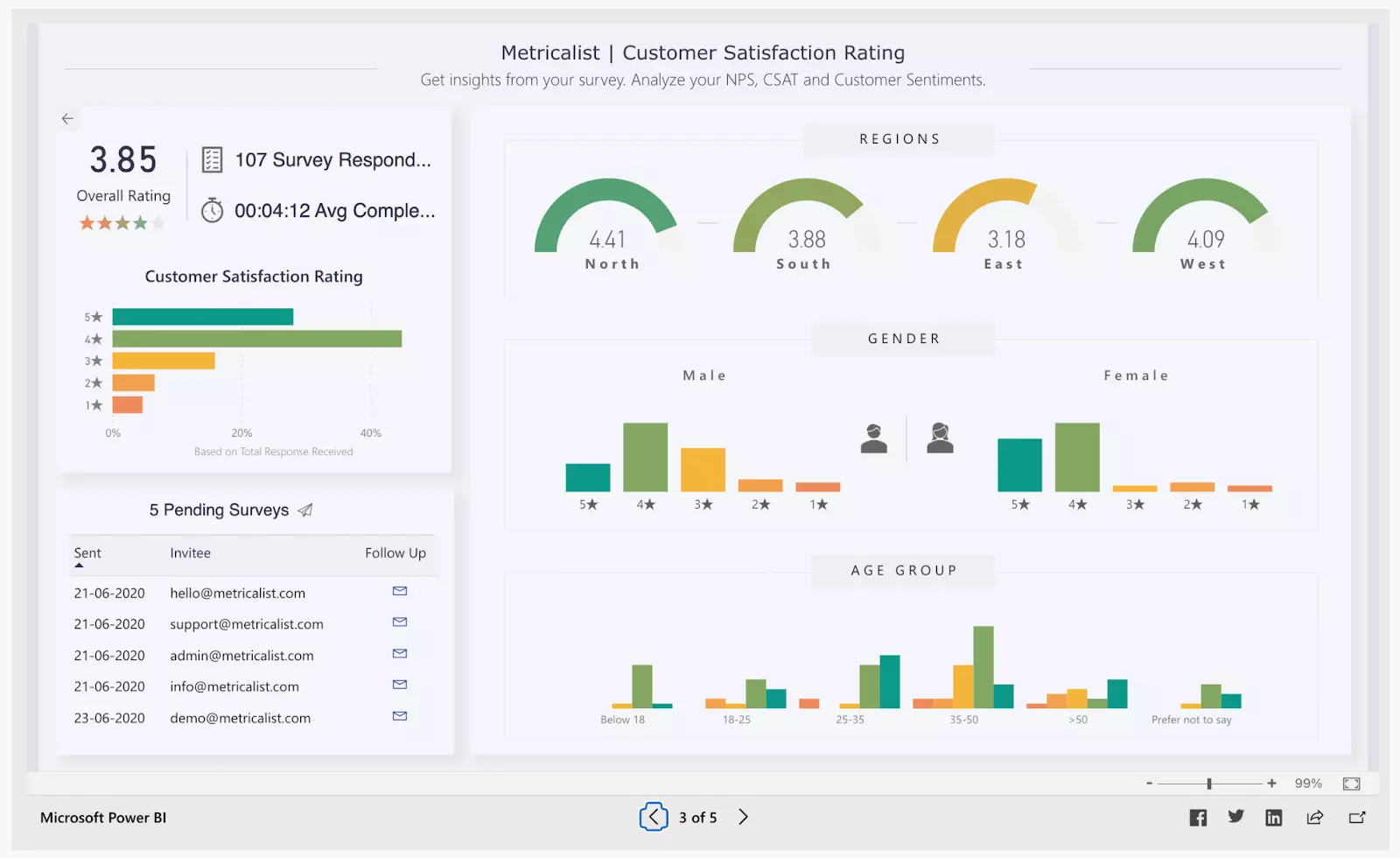
Source: Microsoft Community
What this dashboard offers
The customer satisfaction dashboard contains the selection of consumer responses to help chief/marketing executives make insightful decisions with a deeper understanding of their customer preferences. This sample dashboard can help them –
- Identify segments with the least ratings
- Customer sentiment about the business in color codes
- Analyze survey data on the go

What people love about this dashboard
A summary dashboard like a customer satisfaction report here gives a deep look at the performance of the business region-wise, age-wise, and gender-wise. Although this dashboard is generic, with customized Power BI dashboard development, it can be configured for your specific company or business functions. To achieve this customization, consider hire Power BI developer. The benefits are
- Cost reduction of crucial survey analysis
- Higher productivity
- Quick glance summary
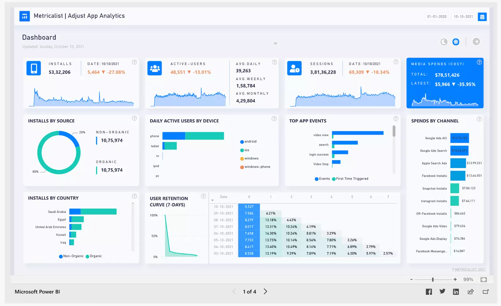
15. Mobile app analytics dashboard
Source: Microsoft Community
Next in the list of Power BI dashboard examples, we have a Mobile app analytics dashboard. It is important to monitor user behavior on mobile apps. For app owners tracking important KPIs is easy with a Power BI mobile app analytics dashboard. It is great for marketers, managers, and owners. The homepage of this dashboard has –
- Total no. of app installs
- Daily active users
- User retention
- Sessions
- Top app events
- Spends by channel
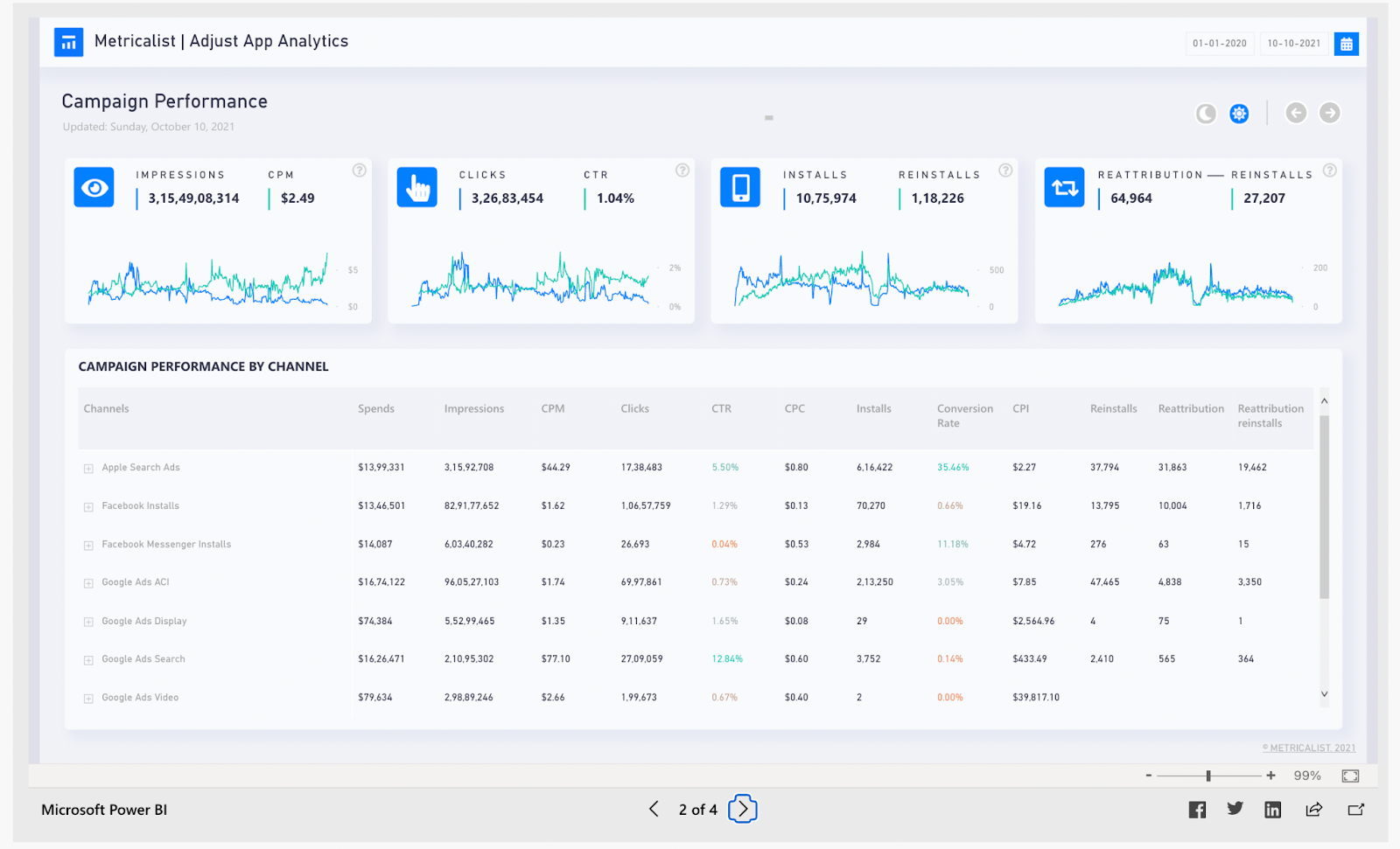
Source: Microsoft Community
The mobile app analytics dashboard brings in all the data of active campaigns on your app. All you need to do is connect the channels to the power BI dashboard. The campaign performance page tracks –
- Impressions
- Clicks
- Installs, reinstalls
- CPM
- CTR
It also tracks all the above metrics for different channels, including Facebook, Apple ads, google, Facebook messenger, and others.
Source: Microsoft Community
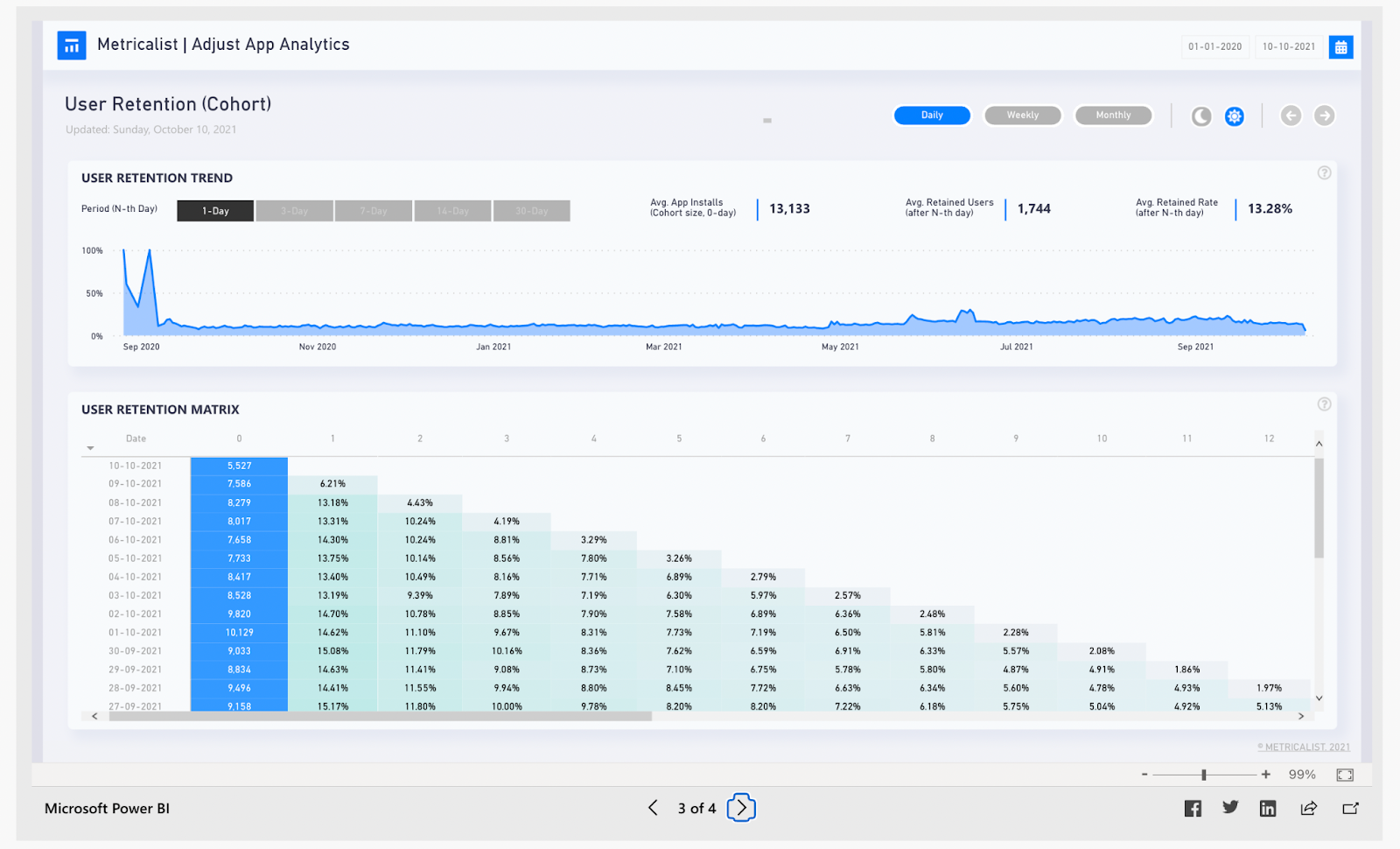
The mobile app analytics dashboard carries a variety of insights about user behavior which include –
- User retention trend as per months
- User retention matrix against data of installation and day of using
- Average retention rate
Source: Microsoft Community
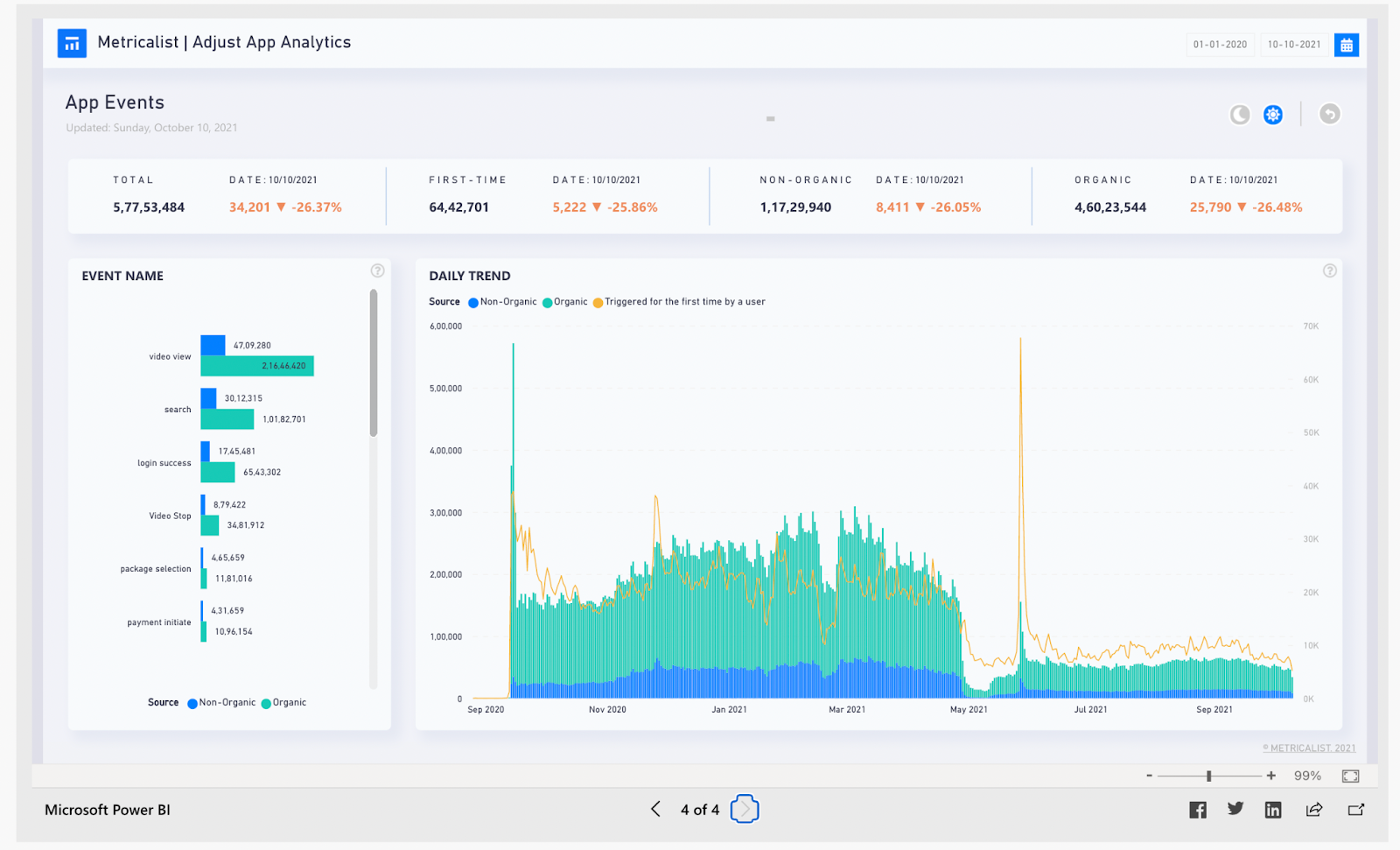
The last tab has the data collection of app events like video views, search acts, location tracking, login access, etc.
What this dashboard offers
A mobile app KPI dashboard is a convenient way to collect important data and view the key metrics at a glance. It offers deep dive into
- User behavior
- User retention
- App activity and events
- Campaign successes
You can explore app performance and user behavior data by selecting any of the tabs in the report.
What people love about this dashboard
With mobile app monitoring and analytics dashboard, owners and marketers can take a deep dive into user intention and product quality, improve sales, and cope quickly in crisis control. It gives the audience’s opinion about the app. Analyzing the data, they can
- Design new features for better user retention
- Run ads on the most profitable channels
- A/B test a new feature
- Track all user activity to enhance the product
To make your app future-ready, a mobile app analytics dashboard is extremely useful for the owner, marketer, and agency. Power BI development company can help you make the best of your app data. Contact us for more info.
16. Airline customer survey data dashboard
Source: Microsoft Community
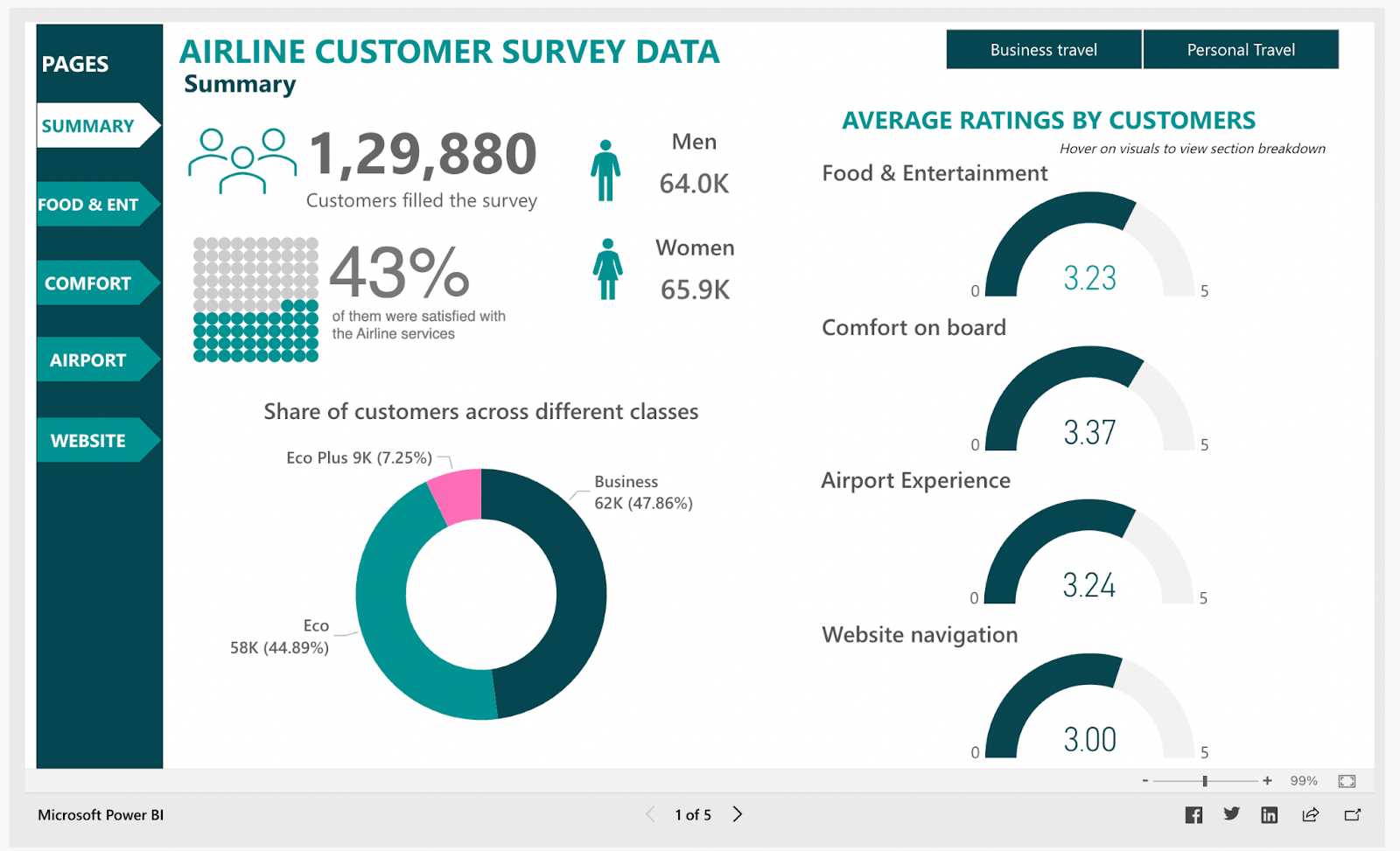
The next in the list of Power BI dashboard examples, we have airline customer survey data dashboard. The airline customer survey data dashboard gives a user-centric and dynamic view of all critical survey data. Airport management authorities can use these data insights to make quick decisions about
- Passenger satisfaction in food & entertainment
- Effect of changes made at the airport
- Comfort experienced during onboarding
- Website navigation and assistance
The other tabs of this dashboard report on the food & entertainment, the comfort of inflight services (like cleanliness, leg room, seat comfort, etc.), and airport and website experience in easy-to-understand colorful charts. Here is an example of the airport experience report –
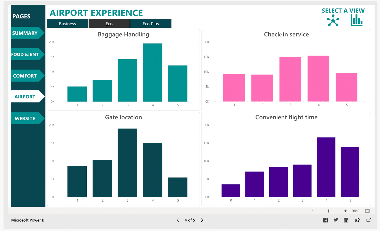
Source: Microsoft Community
What this dashboard offer –
This dashboard provides a quick overview of airport surveys containing key features.
- The total no. of customers who took the survey and the percentage of satisfied passengers are on the summary page.
- Filters to segregate data for eco, eco plus, and business classes.
- A detailed breakdown of survey results for 4 important categories: inflight comfort, airport experience, website ticket booking navigation, food, and entertainment.
What people love about this dashboard
With this dashboard, airport authorities can study staff performance in the airport and inflight. The overall service experience satisfaction index of customers across the three classes can also be studied using the dashboard along with
- Total rating of various services
- Passenger satisfaction statistics
- Airport Staff performance
- Inflight comfort of passengers
17. Email marketing dashboard
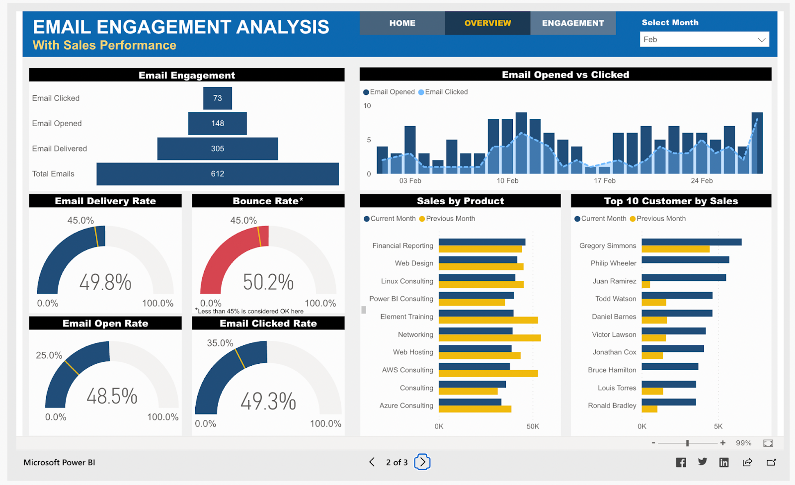
Source: Microsoft Community
It is one of the best Power BI dashboard examples for email marketing sales dashboards. The email marketing dashboard offers valuable insights into customer engagement, product sales, bounce rates, top customers, and more. Ecommerce business owners and managers can use this Power BI dashboard to analyze email marketing and sales growth over time. They can evaluate
- Email opened vs. clicked
- Total emails sent and delivered
- Email delivery rate
- Bounce rate
- Email opened and clicked rate
- Top selling products
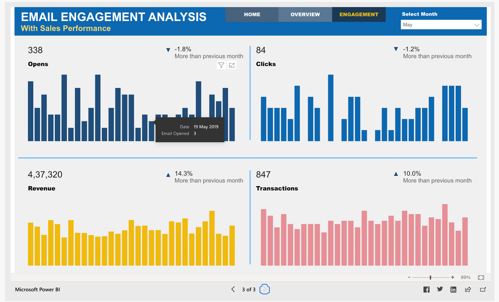
Source: Microsoft Community
The engagement analysis board shows four metrics date-wise; they are
- Emails opened
- Emails with clicks
- Revenue generated
- Total transactions
What this dashboard offers
Email marketing is the most return-generating marketing method. With an email engagement dashboard, business owners can view data to drive profitaBIlity and improve revenue multifold by making intelligent decisions. Managers and business executives can use these charts to
- Compare total sales and profit margins for different emails
- Filter email metrics for all months
- Email-specific growth and profit statistics
- Analyze customer-specific sales and growth
What people love about this dashboard
The dashboard offers actionable insights to small business owners, ecommerce marketers, and executives into key metrics with a single-screen display. The dashboard is
- Useful for both the sales and marketing team
- Great for Customer specific growth
- And has an excellent color combination
This dashboard is built for email marketing stats; with Ecommerce Power BI dashboard development it can also be modified for other marketing methods.
18. Financial performance overview
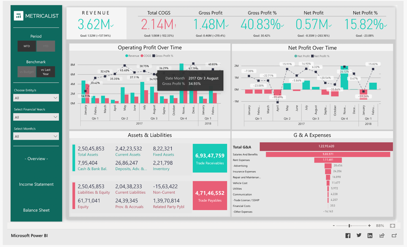
Source: Microsoft Community
Next in the list of Power BI dashboard examples, we have a Financial performance overview dashboard. The financial performance dashboard contains the following features on a single-screen display –
-
- Major KPIs to track profit and loss
- The monthly trend of income statement
- Comparison of two goals
- Summary of assets, liabilities, and expenses
What this dashboard offers
This dashboard is perfect for firms providing accounting services for clients to deliver financial reporting on time. With a financial performance dashboard, there is no need for the old process of manual tasks, which takes a lot of time. It can
- Extract, load data, and create reports
- Deliver multiple reports instantly
- Aid in the rapid growth of a company
What people love about this dashboard
The financial performance dashboard is a solution to traditional manual financial reporting in excel. Power BI dashboard development empowers companies with an efficient modern tool to track financial health. A power BI dashboard provides
- Accurate financial analysis
- Instant report creation for various metrics
- Access to financial information for decision making
- Yearly goals tracking with accurate financial information
Wrap up
We’ve reviewed some of the top Power BI dashboard examples. The Power BI dashboards can be used for various purposes across industries.
Power BI allows users to connect different data sources and extract and present data in reports. Users can share insights across the company while maintaining data consistency, accuracy, and security.
Business leaders can utilize these dashboards to monitor the performance of their marketing and sales teams, KPIs, human resource analysis, inventory, and many more. Power BI developers can help design and optimize these dashboards to meet specific business needs and maximize their effectiveness

With Power BI dashboards, teams can collaborate on the same reports, discuss insights, and share them through other Microsoft applications like Excel and Teams.
Companies can visualize their data with user-friendly reports and dashboards to uncover profound insights. You must use Power BI dashboards to make the right decisions based on data, putting your company in the driving seat.


Similar Posts

8 Mistakes Businesses Make When Adopting Power BI and How to Avoid Them?
Numbers have an important story to tell. They rely on you to give them a voice. ~ Stephen Few Did you know, data is ultimately an organizational asset? You can transform it into information that facilitates actionable-insights for your organization. Microsoft Power BI does just that. You can connect disparate data sets, transform, and clean […]...

Choosing Between Power BI and Excel for Modern Reporting: A Strategic Guide
The world of finance is fast-paced. Creating reports and statements before the official closure is often a challenge. The old methods demand many iterations. This only increases delays and the risk of errors. Luckily, technology has come to our rescue. Tools like Power BI and Excel help you upgrade your reporting capabilities. By offering accurate […]...

Power BI Data Modeling Best Practices
The backbone of any strong Business Intelligence tool is data modeling. Believe it or not, many organizations have seen an increase of up to 35% in data accuracy after following proper Power BI data modeling best practices. Among the advanced tools for data visualization, Power BI can let a business unlock the full potential of […]...