8 Mistakes Businesses Make When Adopting Power BI and How to Avoid Them?

Numbers have an important story to tell. They rely on you to give them a voice. ~ Stephen Few
Did you know, data is ultimately an organizational asset? You can transform it into information that facilitates actionable-insights for your organization. Microsoft Power BI does just that.
You can connect disparate data sets, transform, and clean data. After this, you can convert them into data models and create charts or graphics to provide visuals of the data. Therefore, powerbi is an incredible platform, having so much data power and capabilities. But user errors and mistakes are something that you need to address to fully-utilize it.
Let’s jump into the blog and discuss some common mistakes across different areas of the bi dashboard to make it more worthy for your organization.
#1. Under-estimating Efforts to Understand Power BI
Do you aim to thrive in your business? Understanding data analytics is very important for that journey. However, it is neither easy nor quick to tackle it. You will have to approach strategically, rigorously, and with discipline. It is necessary to train yourself to even view, interrogate, and collaborate with powerful business intelligence.
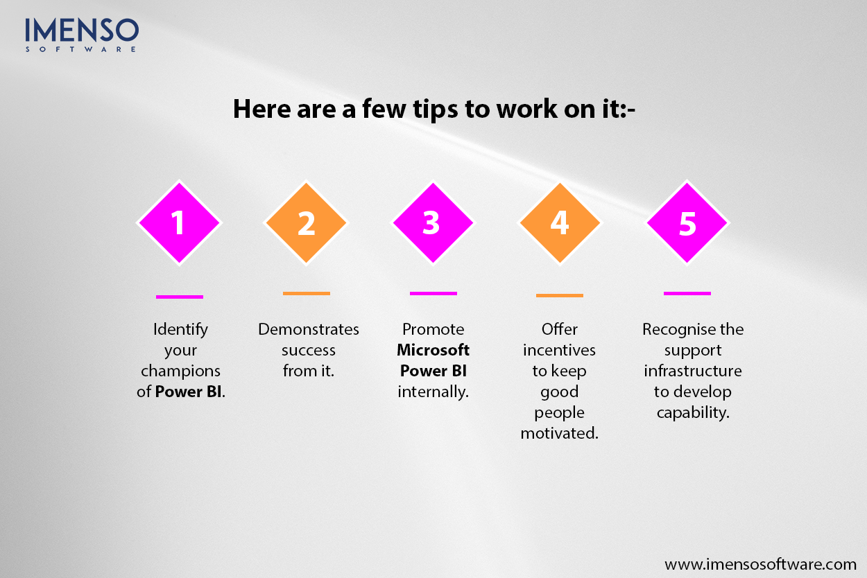
Here are a few tips to work on it:-
- Identify your champions of Power BI.
- Demonstrates success from it.
- Promote Microsoft Power BI internally.
- Offer incentives to keep good people motivated.
- Recognise the support infrastructure to develop capability.
#2. Absence of Strategy and Deployment Plan
The executive team should have a clear plan for data ownership. This might be either centralized to an IT or BI team or decentralized to business units. Here are a few tips to optimize it:-
- Implement hybrid models such as “managed” service to own data centrally, and reports shared in the business.
- Define the strategy up-front, optimizing it according to your organization or the industry you work in.
- Have clarity on content ownership. It drives governance decisions, offering more flexibility.
- Keep the focus aligned adequately to avoid deployment from wandering.
#3. Assuming the User Wants & Needs
We often assume our audiences’ or users’ wants. This might happen due to the pressure of doing Power BI reporting on time.
Look at what can be done:-
- Don’t put random visuals from Power BI Desktop.
- Avoid putting your convenience before the end user’s needs.
- The technique of the “Voice of the Customer” that we use in process or product design applies equally in the design of a Power BI report or dashboard.
Consider asking yourself a few questions before creating a report with power bi dashboard:-
- Who is the audience?
- What insights are they looking for: snapshots, trends, & volumes, relationships?
- Which parameters are they interested in, over what timescales?
- How will they use the information in the dashboard to increase knowledge, understand why performance is this way, understand what went wrong, make predictions, to identify the most important factors?
- How do they want to interact with the report? Website or mobile?
- What options are available for the user to interact with the dashboard?
#4. Ignoring Accessibility
Sometimes, designers don’t cater to accessibility while making reports with the Power BI application. These may include fonts too small, which can pose headaches in bringing them up to accessibility standards. This could impact user navigation seriously.
Here’s what can be done to tackle this:-
- Design your reports for accessibility by default.
- It is much easier to configure accessibility features during the build phase than afterwards. And it encourages good design practices. Microsoft has developed Power BI to meet the latest accessibility standards, so, you can choose to implement them.
- Choose built-in features, including keyboard navigation, screen reader compatibility, high contrast view, focus mode (used to expand a visual), and show data table (screen reader friendly).
Besides this, there are a few features that a designer needs to figure out. This includes, alt text for each visual. Setting a meaningful task for visuals. Opting for a good contrast between text & background and color-blind friendly colors in the theme. You can also check the accessibility in the Power BI documentation to have a comprehensive guide.
#5. Too much reliance on implicit measures
Are you a new report creator for Microsoft Power BI? Implicit measures that are built into visuals are wonderful to begin with. But, here’s what needs to be addressed.
Designers often stick with this approach for too many reports. This is due to fear or ignorance of using the explicit measures available at DAX.
Let’s consider an example:
A business opertaes thorugh mulitple stores in the U.S. The Store A has annual sales of €100k with a profit of €20k. Here, the profit margin is 20 percent. On the ohter hand, the store B, has profit margin of 30 percent with anual sales of €300k.
Now, the report maker wants to offer its users a slicer to choose multiple stores and provide the consolidated % profit margin. Here, the common mistake that might happen would be choosing the “Average” implicit measure. But, it would compute the average of 20 and 30 percent to 25 percent. Whereas the true value should be 27.5%.
This is a common problem that should be addressed when you are dealing with non-additive measures. As with percentages and ratios.

Have a look at what could be done best to handle this:-
- Encourage your report measures to ditch the implicit measures unless it is offering the precision and accuracy.
- Promote the use of explicit measures with DAX as best practice.
- Work with super-users of DAX in your organization to address more challenging scenarios.
#6. Bad Model Structure
Thanks to the interesting features of power business intelligence, anyone can start creating reports for free. However, it is a point of concern, too, because new users often get excited to pull data from multiple sources. They often don’t know that power bi looks for and creates relationships between the different data tables.
It has a filter context through which it creates a data model in the background and relationships in the model. This induces filtering paths to determine the output values in the report. If a user is unaware about these best practices, it might result in reporting incorrect values.
Look for these recommentations to tackle this.
- Don’t allow new users to work with Power BI Desktop, unless they are trained for the basic understanding to use it.
- Train them to undertand data, model it, visualize them and other aspects of data to develop an undertanding of star schema.
- You can aso choose to go for more advanced otions in order to iporve the modelling skills.

This helps reporters to figure out the requirements for data modeling and ways to structure it.
#7. Skipping Date Table in the Model
Do you know that date tables are counter-intuitive? Are you interested in creating a dated list of events and plot a graph over time? This is possibel with DAX in Power BI. However, many new users are unaware of it.
The main problem arises when you need to have 2 or more time series graph on the same report. Sometimes, you may encounter 2 sets of date-stamped data and need to filter the time span simultanoeouly on both graphics. Here, the concern is you cant do it if they don’t have conidciding dates. Theresore, setting a relationship between them might work. As a result, this restricts the navigation option for the end-user.
Here’s what can be done to fix this:-
- Encourage reports to use dat-table to crate or develop every model as the best practice.
- Learn about the critierias that is to be satisfied to work with this flow. Forx ex, by using DAX for caluation table or create power query. ALthough, using date table by importing it via Power Query is an easy option.
As a result, it imporves consistency for all the Power Bi users across your organizaiton. This would alos increase efficiency for creators to matin a single organisation-wide date table for all Power BI users.
#8. Trusting Excel matrix data models too much
Attention, if you are also the one doing this! Matrix format is ideal fr using in excel that might look insightful but is problemtic. However, it is good to be used in the excel where each cell can carry diffrent formats. But, with Power BI, data is to be in columnar format.
So, when a user uses Pwer Query to transform the data from matrix format to columnar format it undergoes thorugh numerous transformation steps. Here, every step is an oppotuintuy for a error in the future.
You might see that your Pwer Query will break and power bi would hglitt it.here, you are lucky to get a cance to fix it. Or, you might see that query will pass with eros and your visuals would reflect incorrect sales totals.
What could be done to fix it:
- Consider every step in the power bi as an opportunity for something to go wrong.
- Keep in mind that the process complexity may also increase the potential for failure at some steps.
- So, to minimize the transoformations required feed your data into Power Query in a columnar format as much as possible.
- Feed your Power Query with sheet having columnar fomat. It is better to see any issues in Excel itself.

Power BI Is Powerful—If You Use It Right
Microsoft Power BI, is more than just a pretty dashboard to that helps you to see colorful visuals. It’s a powerful way to turn your business data into smart decisions. But, just like any other tool, you can utilize it’s benefits, if used in the right way. Avoid doing common mistakes by implementing the practices to team up for success.
So don’t just adopt Power Business Intelligence, own it. Learn it. Grow with it. And watch your team become more confident, more efficient, and more data-driven every day.
FAQs: Power BI Mistakes & Smarter Adoption
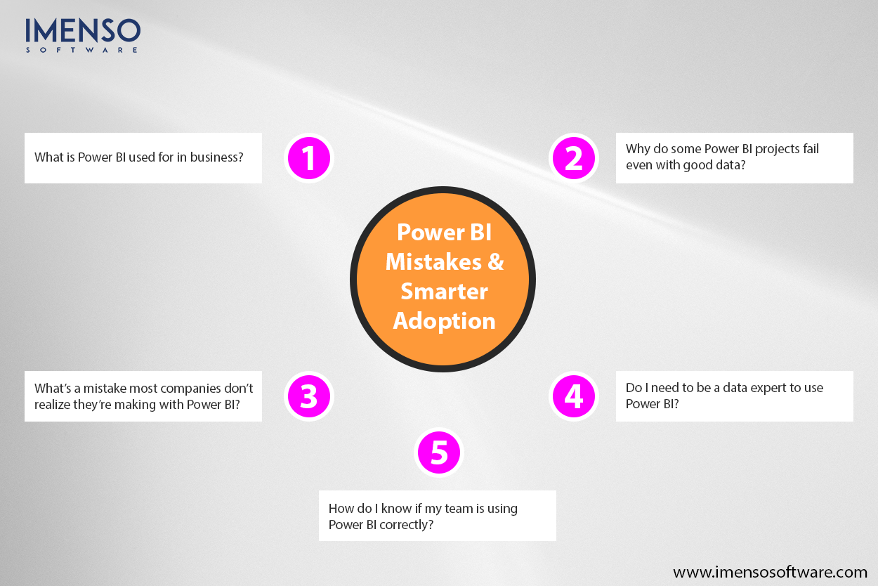
Q1. What is Power BI used for in business?
A: Power BI helps businesses turn data into easy-to-read dashboards, so teams can track goals, spot trends, and make faster decisions. It’s one of the top Microsoft Business Intelligence tools available today.
Q2. Why do some Power BI projects fail even with good data?
Even with clean data, projects can fail if business users and data teams don’t collaborate. A common mistake is building dashboards based only on technical input without understanding what decision-makers actually need to see.
Q3. What’s a mistake most companies don’t realize they’re making with Power BI?
Many forget to set up role-based access. That means everyone sees everything, which can cause confusion or even data security risks. Creating Power BI dashboards with the right views for the right users is key.
Q4. Do I need to be a data expert to use Power BI?
No! Power BI was made with business users in mind. You can drag, drop, and create reports without writing code. But having a data team or analyst for setup can help avoid early mistakes.
Q5. How do I know if my team is using Power BI correctly?
A good sign is when your team uses dashboards regularly to guide choices. And those dashboards are easy to read, up-to-date, and tied to real business goals. It may be time to review your setup, if your team avoids using them,
Want more information about our services?


Similar Posts

Transform Your Business Operations with Microsoft Power BI
Back in the 1970s, companies had to handle a lot of paperwork for every department. But with the invention of the computer, now in 2021, everything is digital. Because of the revolutionizing technology of computers, there is minimal paperwork and hard copies of business records....

Data Cleaning in Power BI: Tips for Getting the Most Accurate Visuals
“Without clean data, or clean enough data, your data science is worthless.” – Michael Stonebraker, adjunct professor, MIT. Imagine steering a ship with a damaged compass. It wouldn’t let you reach your desired destination. This is what it’s like to make decisions based on unclean data. It leads to misguided steps, financial losses, and missed […]...

Top 10 Data Visualization Tools for 2024
Are you feeling overwhelmed and unable to make sense of the sea of data available? You are not alone. Every day, we generate a large amount of data, about 402.74 million terabytes. And it’s only going to increase! This can be challenging for entrepreneurs, businesses, and individuals, making it difficult to find relevant information. According […]...