App Design – How We Build Better Applications With Behavioral Psychology & Design Principles
Hundreds of thousands of apps, no-code tools, digital products, and millions of websites are available over the internet. While some are great successes, others don’t even exist for a large population. Only a few products succeed in hitting their target market and explode, while others live in the abyss of the internet.
One of the key differentiating factors is UX. The UX of a digital product, app, or website is the design, navigation, colors, and aesthetics. A great UX can make users go crazy for a product and decide whether it’ll succeed or not.
The goal for a product is to hit the magic number of 1 million users or subscribers. But to hit the right nerve in a million people takes a deep understanding of human psychology and behavior.
Here is where the expertise of UX designers comes into play. They know the key which triggers the human brain and motivates them to buy a product or download an app.
The connection between psychology and UX design
We are many; the larger we grow, the more variety of thought patterns, thinking behaviors, likes, and dislikes. But even in such diversification, there are codes to crack, and UX designers keep discovering these to create something that billions of us like.
The human mind is the smorgasbord that all UX designers aim to uncover. From living in the jungles and hunting for food, we have now built spaceships and high-resolution telescopes to look into far, far away galaxies.
On the outside, it might seem like every individual has a unique set of desires, whims, and fantasies. But if we observe closely, there is a connecting thread of basic instincts, which is similar for most people.
Today, even the basic needs of human life depend on some kind of app or device. Keeping these digital means minimalistic in design and high in use is important.
Also Read: Biggest Offshore Development Problems (And How to Solve Them)
This is where UX designers and their understanding of behavioral psychology and cognitive biases solve the presentation problem. They uncover patterns and design products that subconsciously influence users and help them solve problems and gratify their needs.
What is cognitive psychology?
Cognitive psychology is the study of motivation, creativity, decision making, problem-solving, reasoning, learning, and more. It is a vast subject, and there is no hard line that categorizes brain reactions under cognitive psychology.
In short, it explains how the brain responds to a specific situation while under the influence of external stimuli.
The three main approaches to cognitive psychology are experimental cognitive psychology, computational cognitive psychology, and neural cognitive psychology.
Understanding cognitive psychology in UX design
UX is about how humans interact with something on the screen, their attention and perception, mental process, thinking, etc., and cognitive psychology is the study of human behaviors, mental responses, and more.
There is a deep connection between design and psychology. And if you think otherwise, you are far from the truth.
As UX designers, we try to understand people’s desires, needs, expectations, habits, and more.
The best UX designers understand cognitive psychology and know how to use its principles to reduce the mental load and improve the following –
- Usability
- Navigation
- Accessibility
- Readability
UX designers aim to create a product that will lead users to an expected result. And that is what our team of UX designers focuses on in every project. We use our power to create an experience that stays with the user.
Today we will see the different design principles that contribute to excellent UX quality and help create the experience businesses want for their customers.
Psychological design principles
1. Retention theory
Retention theory says that human beings can focus for a certain time.
Online, while surfing a website or app, there can be many reasons they lose this focus, for instance, the placement of elements surrounding the information the user is trying to retain.
Retention theory helps UX designers to –
- Estimate the amount of information
- Assess the time required to consume the information
- Predict hurdles that will impact information retention
Many things can affect the retention of information on the screen, including fonts, colors, images, and the position of elements.
Also Read: 8 UX Trends You Can’t Ignore in 2021
Using retention theory, UX designers can increase the time users interact with the product.
How retention theory applies to UX design?
When a user lands on a website, it is best if they stay on the homepage for a while before moving on to the product or service pages.
How long the users stay on the homepage depends on how fast they can comprehend the information they see, and the sooner they move.
So if you want your customers not to feel overwhelmed by information, the homepage should have an organized design.
Retention theory can help optimize the time spent and the amount of information on a page.
Check out the example below.
This happens when UX designers fail to consider retention theory in designing web pages.
The readability and scannability of this Hacker news page are difficult for users due to the lack of white space between article headings. And although there are options to sort, see the submitter profile, or go to the news section, they are all practically invisible.
A page with such a design can put users in a long period of confusion.
Let’s look at two more website homepages.
Both of these websites have too much information on one page without a coherent placement of images, text, and tabs, which is not pleasing to the eyes. The screen confuses the user about where to go or click next.
These designs create cognitive barriers for the end-user, and they leave the website without retaining any information precisely.
Key takeaways –
- Limit the amount of information on a given page or screen.
- Reduce the cognitive load for users by providing information in a structured manner.
2. Hicks law
Psychologists William Edmund Hick and Ray Hyman set out to find the relation between the number of stimuli present and the time required to make a decision.
Also Read: Top 10 User Design Strategies Of 2021 To Reduce Bounce Rate
And as one would expect, they proposed that the time to make a decision increases with the number of available choices. As the number and complexity of choices increase, the time to conclude increases too.
How to apply Hicks law to improve UX design?
Imagine a user is looking to buy gadgets and they land on a webpage like this:
The visitor won’t be able to think for two minutes because they will be engaged in processing the information given on the page.
There Are too many options on a single page.
People should not be bothered by too many stimuli; it delays them from making a decision.
Hicks law helps UX designers not overdo choices. Users prefer fewer choices at a time rather than being bombarded all at once.
That is why our designers don’t give your customers too many choices at once. Without being overburdened by so many choices, they will navigate through the website smoothly and leave satisfied with your business.
Key takeaways –
- Reduce the cognitive load on users with a simplistic design.
- When everything depends on response time, minimize choices for the users.
- Break down complex tasks into steps to decrease the cognitive load. But be mindful not to simplify to the point of generalization.
- Too many recommended options overwhelmed the users.
3. The serial position effect
Here is another picture for you:
Which MacBook covers do you see first?
The first one, then immediately your attention jumped to the last one in the series skipping the rest in the middle?
We know the answer is yes.
This is because of the serial position effect coined by Herman Ebbinghaus. He described that the position of an item in a list affects its recall certainty. According to this psychological theory, humans’ ability to retain information is affected by the order in which it is introduced.
Also Read: The Most Trending Online Marketplace Apps In 2021
It states that the information at the beginning and end of a list is more likely to stick with users than the information in the middle.
For instance, we often tend to remember the beginning and end of a movie, speech, and story.
Top ecom and product companies like Apple, Nike, and Amazon have used the serial position effect in their website UX designs to manipulate user behavior and create better experiences.
This effect is divided into two parts – primary effect and recency effect. Humans remember the first items in a list due to the primary effect and the last items due to the recency effect.

How to use the Serial position effect in UX design?
Look at the picture below –
Did you notice the product’s name on the left top corner and the buy button on the top right?
This is a typical example of the serial position effect in use. The start and end of the page have the most important information.
Many landing pages are designed using the same principle. You can also see this in movies, textbook writing, and speeches where the critical information is presented in the beginning and concluded again in the end.
Key Takeaways –
- Users tend to remember the first and last items in a series.
- Placing the most important items in the beginning and end helps because these items are fed into the long-term and short-term memory of the user.
- Key navigation buttons should be placed on the far left or far right for easy remembrance.
- Emphasize key information at the beginning and the end.
4. Fitts’s law
Fitts’s law studies the motor function in humans and accurately predicts the time taken to move and select a target. It states that the time required to move towards a target is proportional to its distance and inversely proportional to its size.
When applied to the world, it means that fast movements and small targets are difficult to hit and have a higher error rate.
How to apply Fitts’s law to UX?
Fitts’s law is widely prevalent among leading UX designers and product engineers worldwide, and it is widely applied to UX and UI while designing top products, applications, and websites.
One of the things that Fitts’s law has changed forever is to make the interactive buttons large, especially on mobile devices. Smaller buttons are difficult and time-consuming, especially on a touch device.
Also Read: Freewheeling with Design- Five Most Popular CSS Frameworks of 2018 for You
Another application of Fitts’s law is to shorten the distance between the tasks and the related button.
For instance, here is a screenshot of our UI/UX design services page. See how the button to start a project is big and highlighted with a different color to get quick attention. It is also placed near the contact page to reduce the time for users to connect with us.
Key takeaways –
- Make elements large, easy to select, and position them close to users.
- Important buttons and links should have sufficient distance between them.
- Place touch elements in the user interface where they are easily acquired.
5. Miller’s law
George Miller gave Miller’s law in 1956. It asserted that the immediate memory and absolute judgment were both limited to around 7 pieces of information.
The breakdown of Miller’s law for UX to design is that an average person can only keep 7 (plus or minus 2) items in their working memory.
Now, the key here is not to get stuck on the number 7. Applying Miller’s law to UX is about breaking down the information into digestible chunks for the user. So that they can get to the information they are looking for in easy ways without the process creating a mental load for them.
Basically, chunking is the gist of this law.
How does Miller’s law apply to UX?
This is the image of the Nike menu for womens.
Imagine if they have listed all the options under one tab without sorting!!!
It would take users forever to decide what they want to buy.
But Nike is smart. They sorted about similar items and put them into 6 subheadings. Here another thing to pay attention to is that they are not fixated on the number 7. Under the clothing section, 19 options make sense, look aesthetic, and are easy for users to choose from.
There are 6 subheadings to go through, which helps users know which chunk to focus on and click on the item they want to buy.
Key takeaways -
- Don’t focus on the number seven to create unnecessary design limitations.
- Divide and organize content into smaller chunks to help users sort, understand, and memorize quickly.
- Short-term memory varies for every individual depending upon their previous interactions and knowledge with an interface, app, or website.
6. Pareto principle
You must have heard of this before; the Pareto principle states that 80% of results come from 20% of efforts.
This principle was first given by Vilfredo Pareto, an economist who noticed that 80% of Italy’s land was owned by 20% of the population. Though this statement doesn’t strike at once, thinking in the 80/20 manner provides a lot of insights into uneven reward systems, which can also be applied to UX design.
How to use the Pareto principle in UX design?
The 80/20 rule varies with the context and field it is applied. But we don’t get hung up on numbers, and our UX designers focus on identifying the tasks that bring the most results.
We aim to identify the few variables causing the most results for the client’s business.
- Where is the most money being spent?
- Which 20% of code causes 80% of problems?
- Which aspect of the product has the most value?
For instance, if 80% of customers complain about the same issue, it must be fixed immediately. If 80% of website traffic comes from only 2 pages, then those pages need to be refined to the max capacity.
Key takeaway -
- Results are often not equally divided.
- Not all inputs have the same results.
- A large number of users may contain some of the big contributors that affect the results most.
- Focus on the 20% efforts that bring the most results for users.

Some Thoughts to Conclude
UX psychology is the secret to building great products for users, and it helps understand why users prefer a certain product design and interact more often.
Design principles enhance the user experience by understanding human behavior. But these powerful tools should not do more harm than good.
It is important to empathize with the users to know their problems and provide a solution through your product.
The intent to create a product that users will love is noble but exploiting them is not. With such powerful tools at our disposal, we ensure that the principles are used to empower users, not overpower them.
Our UX designers learn to recognize these principles into action through testing and pick up on non-verbal cues to create more meaningful products.
Start designing better user experiences with UI/UX designers from Imenso Software. Call us today!
We’re honored to mention that our efforts have been recognized by renowned B2B review and research platforms such as GoodFirms, Clutch, MirrorView, and many more.
Similar Posts
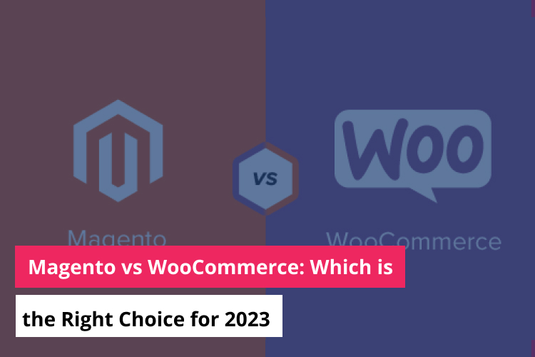
Magento vs WooCommerce: Which is the Right Choice for 2023
With millions of new online stores opening each year, e-commerce has integrated itself into the current world. When you take the fierce competition into consideration, the choice of an e-commerce platform gets even more crucial to the success of your business. Two of the most popular e-commerce platforms are Magento and WooCommerce, and each has […]...

Top 10 Front-End Frameworks for Modern Web Development
In today’s digital landscape, front-end development stands at the forefront of innovation, enabling the creation of dynamic, responsive, and visually stunning web applications. With an array of front-end frameworks available, software developers have a wealth of options to choose from when embarking on modern web development projects. These frameworks not only streamline the development process […]...
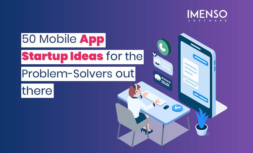
50 Mobile App Ideas for the Problem-Solvers Out There
Are you looking for the best mobile app startup ideas? If yes, you have come to the right blog! Of course, there’s an app for that.’ When Daniel Kraft, MD, uttered these words about his digital stethoscope, he was neither exaggerating nor fooling around. After all, isn’t there an app for everyone and everything around? […]...