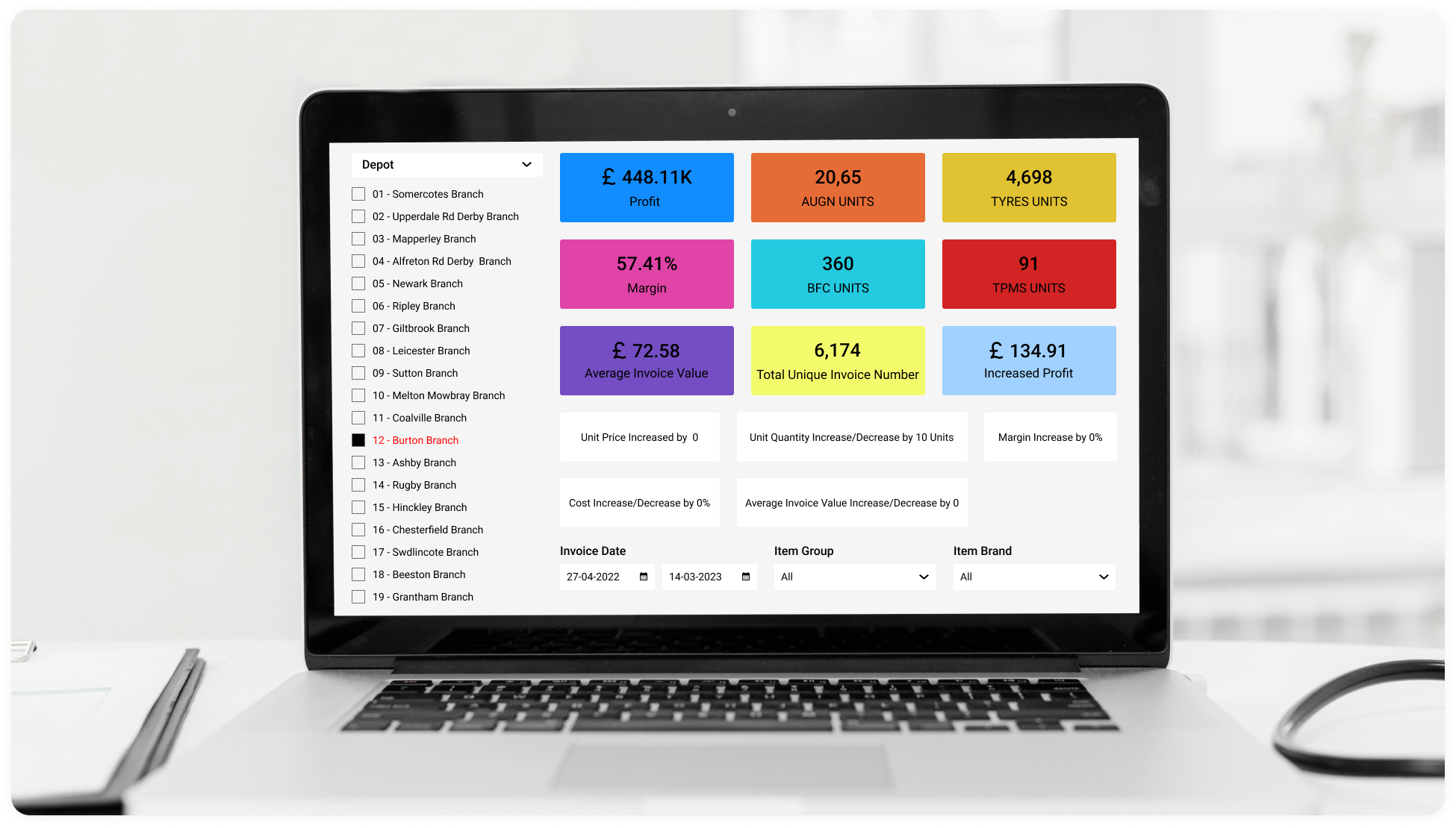
Unified reporting and "What If Analysis" tool.
- Industry: Automotive Services
- Country: U.K.
The main goal of this interactive dashboard is to create “what if analysis” based on different parameters that will help them to understand the data in more clarity. By utilizing cutting-edge visualization techniques and combining various data sources, the project significantly improved the user experience, operational efficiency, and data-driven decision-making.
The core challenges
- Environment for unified reporting: The automotive industry faces the challenge of managing its vast data. The synchronization of all newly introduced parameters and components with the report results in a smooth and unified user interface across the dashboard.
- Data optimization: The automotive industry had to create strong logic structures to manage intricate computations and data transformations, enabling the development of more advanced reporting and analysis tools. This demands expertise in both data management and software development.
- Data filtering enhancement: Enhancing data filtering methods to analyze the data for different sectors and fields is a bit challenging, which we did by adding sophisticated tools that provide customers with the ability to precisely extract insightful information and enhance data representations.
- Enhanced functionality: Since making a dynamic and smooth filtering analysis dashboard is time consuming. We did control dynamic modifications, guaranteeing the smooth incorporation of parameters for diverse data inputs and improving adaptability and flexibility in the reporting system.
- Report synchronization: Arranging for the new components to be synchronized with the entire report in order to preserve data consistency and integrity throughout the dashboard.
Solution The solutions work together to improve the dashboard's value proposition, efficacy, and usability for users in the automobile sector while also addressing the project's issues. The following solutions have been used by the project in order to address the challenges:
-
 What if parameters: The introduction of dynamic parameters enables real-time adjustments to meet shifting company demands by modifying costs, profit margins, and quantity.
 -
 Modular dashboard elements: Creation of visualization elements, such as cards and boxes, to graphically depict higher key indices and give consumers instant access to understandable information
 -
 Data visualization: The creation of an aesthetically pleasing and well-organized tabular data representation is facilitated by the use of conditional formatting on easily navigable pages. Including more metrics, columns, and charts that highlight important indicators and expand the scope and depth of data analysis capabilities.
 Embedded the report: Embed the report into the web application, making it easily accessible and seamlessly integrated into the user's workflow. This empowers users to access and interact with the report directly within the application environment.
Integration.
Equipped with a variety of
data source.
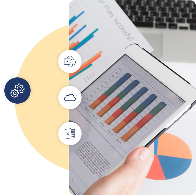
Power BI is enhanced and made more compatible by the numerous ways, it can be integrated with other apps and tools. We have utilized some of these integration options for this report:
- SharePoint folders
- SharePoint
- One Drive
- Excel Spreadsheets
Customization.
We took charts to the next level?
Not only have the charts been merged, but they have also been customized to improve data visualization and provide a more accurate depiction that precisely matched each charts distinct features.
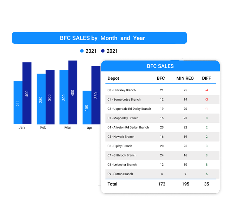
Enhanced data visualization
Utilizing conditional formatting strategies to draw attention to significant data points and trends enhances the readability and efficiency of user-facing visualizations.
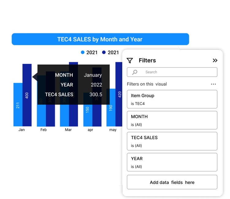
Page and report level filters
Utilizing the Page and Report Level Filters, users can filter pages and visuals according to specific requirements, ensuring a tailored analysis of the data.
Enhancement.
By adding useful features.
We've added a number of features that enable users to interact with charts and data in a seamless manner in order to improve the application and user experience.
Using edit interactions to enhance interactivity
By integrating Edit Interactions features, we enhance user engagement in our report and provide a more tailored and intuitive experience.
Sync- slicers
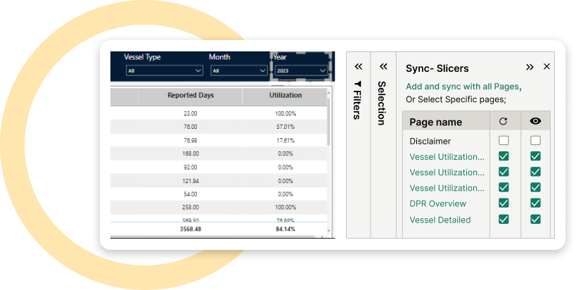
We have used the sync-slicer functionality in our report which empowers the users to make selection on one report page and have those filters automatically applied to all pages. This ensures consistency and reduces the need for repetitive filtering and streamlining the analysis process.
Explore more.
Additional features.
KPI reporting. Key Performance Indicators (KPIs) are integrated with formatting so that users may use data trends and performance metrics to gain actionable insights and make wise decisions.
Conditional formatting. We have utilized conditional formatting which ensures that visual representations of data dynamically adjust based on specified conditions. Which empowers users to highlight critical trends and identifying areas of concern or success within the dataset.
Looking to build similar
solution for your business?
We have all the required expertise to help your business grow
