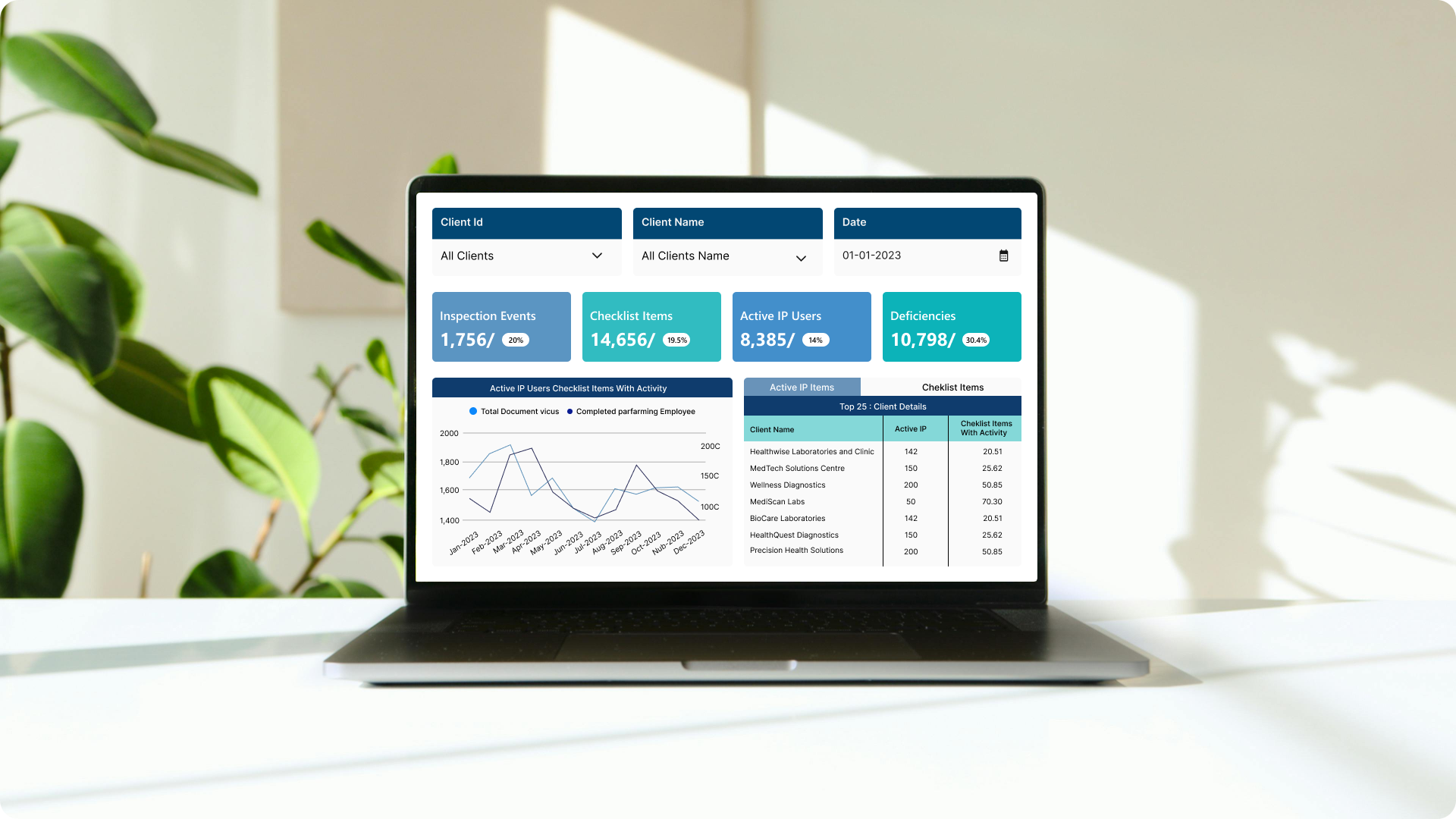
The goal of this visualization is to create a business information dashboard to help decision-makers. They use it to make more informed decisions about workflow and process flows. With this visualization, one can identify emerging trends and anticipated business actions, which will help in understanding the company's financial, technical, and operational features.
The core challenges.
Solving slow data retrieval performance issues and customizing data models to meet specific business needs.
- Slow SQL database data retrieval: The main difficulty at first was getting data straight into the Power BI report from the SQL database. Because there were many sophisticated queries and a big number of data, the procedure performed slowly. To address the issue of slow data retrieval, a pipeline was created to integrate data from the SQL database to a Direct Lake.
- Migration to lakehouse architecture: This required building SQL views and adding capabilities like schema enforcement, indexing, and query optimization to turn the current data lake into a Lakehouse.
- Data modelling: The limitations of the current views and the restrictions imposed by the data structures that were provided made it difficult to implement additional modelling.
- Overcoming issues with large data sizes using fabric license Solutions: We decided to use a fabric license as a solution to the problem caused by the massive data size. We were able to handle and analyze massive amounts of data successfully once this solution addressed the problem.
- Optimal schema selection for data models: The applicability of the star and snowflake schemas is counsel to clients while developing data models. We guarantee customized, functional data models by coordinating the choice of schema with report requirements.
- Optimizing data models using date filtering: The prior data model's big data size and date table's date/time format caused delays in the data filtering process. In order to solve this, we proposed that the date section in the date column be displayed only (with the time set to 00:00:00). This increased speed and sped up the process of filtering data.
- Complexity of utilizing DAX functions with direct query: Using Data Analysis Expressions (DAX) functions might be difficult when utilizing Direct Query mode, even though it provides real-time access to data.
SolutionIn order to speed up the information retrieval process as part of the transition to a Lakehouse design, we leveraged the data from the One Lake Datahub. The current data lake needed to be turned into a Lakehouse, which meant building SQL views and adding capabilities like query optimization, indexing, and schema enforcement. We addressed problems with data modelling in Medialab companies for Power BI reporting through a systematic approach. We constructed Power BI reports utilizing the direct query mode, which eliminated the need for data duplication or caching and allowed us to analyze data stored in the Lakehouse in real-time.
-
 Centralized data management: Our Lakehouse structure made it much easier to manage business by bringing all of our data together in one location.
 -
 Drag and drop charts: Use the drag-and-drop functionality to reorganize Cards, Line charts and Table visualizations while maintaining your layout automatically
 -
 Embedded reports: Interactive Power BI dashboards and reports may be easily integrated into custom websites, client portal or applications using Power BI Embedded. Because of this, businesses may easily incorporate data visualization features into their own apps, giving customers access to comprehensive, interactive data analytics without requiring them to leave the application environment.
Integration.
Equipped with a variety of
data source.
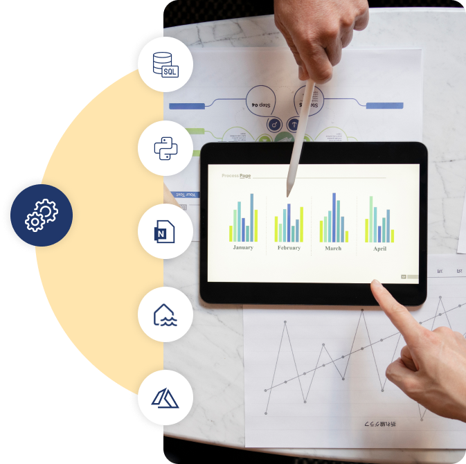
A wide range of integration options are available in Power BI to improve its functionality and compatibility with different tools and applications. To create this report, we've leveraged the following integration capabilities:
- SQL Server
- Python Code
- Notebook
- Lakehouse and Warehouse(Fabric Integration)
- Azure Services(Azure SQL Database, Azure Analysis Services)
Enhancement.
By adding useful features?
A number of features have been incorporated to improve functionality and user experience.
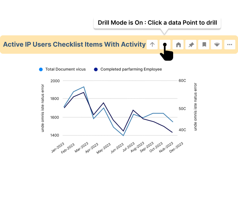
Drill down
Users can view related line charts instantaneously by clicking on primary chart points, which facilitates diving down.
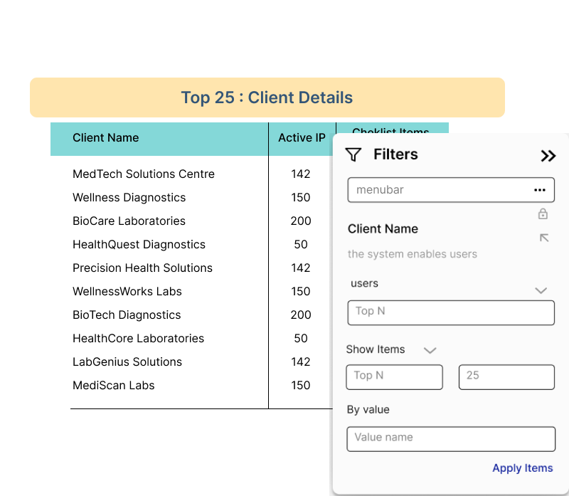
Top N
Add a "Top N" function to table visuals to improve data visibility. This enables users to concentrate on the top N things according to pre determined criteria.
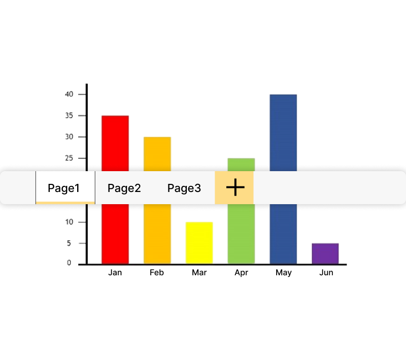
Page navigation
Make navigating between charts easy by using dropdown menus or obvious back buttons.
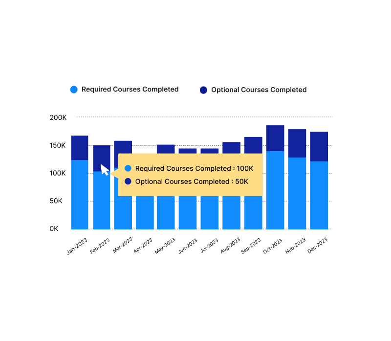
Button and tooltip
Add interactive buttons to visualizations to give consumers choices they can take action on. Better yet, include tooltips to help users comprehend button operation and provide contextual information.

Built-in format capabilities
Bring to Front" feature makes it possible to precisely align shapes over card images, guaranteeing a professional and uniform formatting.
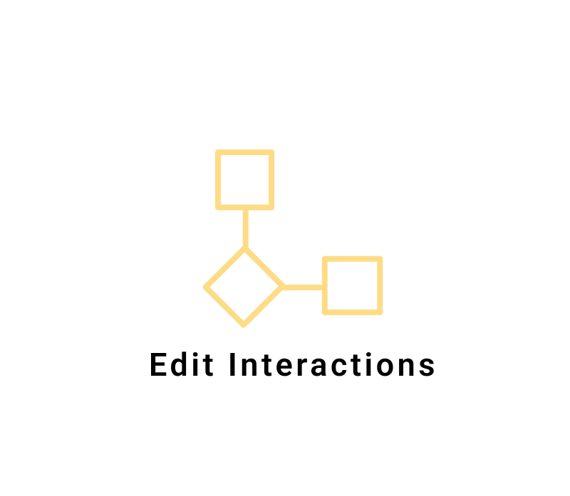
Using edit interactions to improve interactivity
We improve user interaction in our report by incorporating Edit Interactions capabilities, offering a more user-friendly and personalized experience.
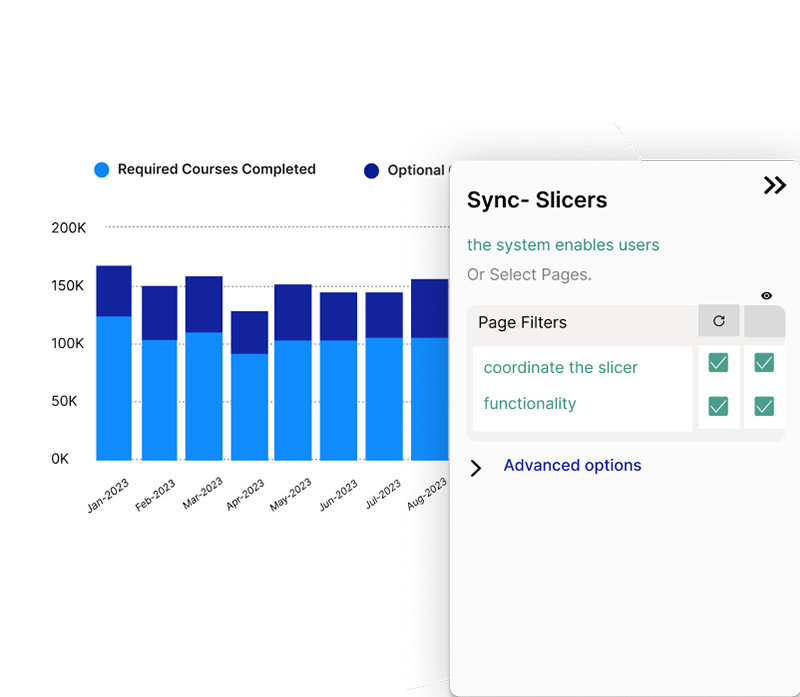
Sync- slicers
Users can coordinate the slicer choices across several report pages in Power BI by using Sync Slicers. With this functionality, users can filter a report consistently across several pages by selecting the same value in one synchronized slicer, which is simultaneously selected in other synchronized slicers as well.
Explore more.
Additional features.
Single Sign-on (SSO).Installed an integrated Single Sign-On authentication system, enabling users to log into several applications with just one set of login credentials.
Scheduled Data Refreshes. This report's implementation of periodic data refresh guarantees that the data is updated on a regular basis, preserving its relevance and accuracy.
Customized UI. To increase accessibility and functionality, this required improving the visual layout, including clear navigation components, and maximizing interactive features.
Key Performance Indicators. Integrated a wide range of KPIs to systematically evaluate and enhance the productivity, and overall performance of healthcare practices.
Improving Data Integrity with Composite Model Integration . This allowed us to seamlessly access real-time data from Direct Query sources while leveraging the performance benefits of importing smaller datasets into the Power BI model. In order to remedy the absence of columns in our existing views, we used a composite model that combined two different datasets. This method kept excellent efficiency while integrating further data in a fluid manner, supporting our analysis's comprehensiveness.