Sales projection and demand trends dashboard.
- Industry: Manufacturing
- Country: UK
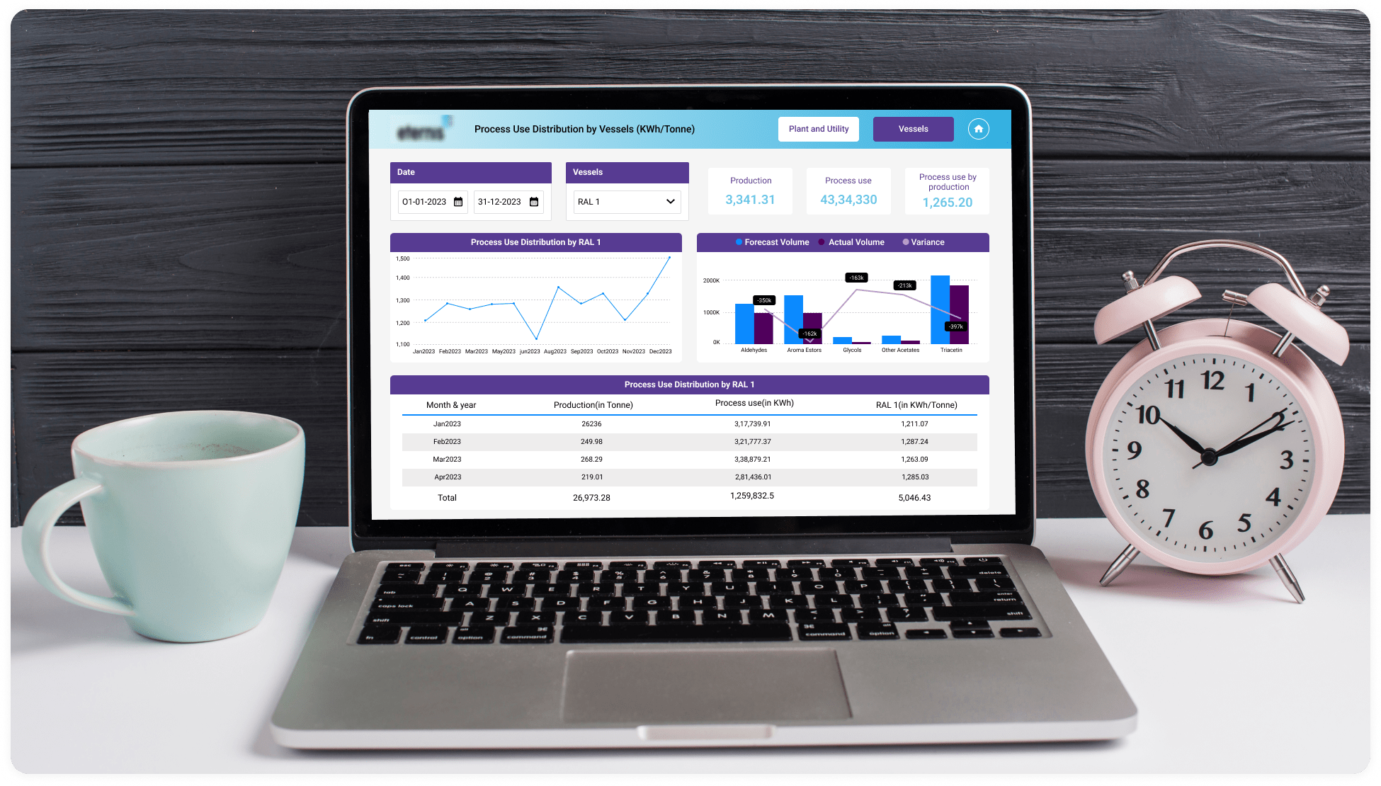
The main goal of creating a Power BI dashboard for chemical manufacturing sector is to offer detailed information on sales results, productivity and energy consumption in relation to steam vessels. Professionals can use it to keep an eye on important metrics like production output, sales projection and demand trends, which helps with operational and strategic decision making.
The core challenges
Addressing issues with performance resulting from slow data retrieval and customizing data modelling to meet specific business needs.
- Unified data model: Chemical manufacturing involves various processes that generate data in different formats like Consolidate data from SharePoint folders, SharePoint lists, CSV, data, OneDrive, and Excel spreadsheets into a unified data model.
- Complex data analysis: Data involves complex relationships and various analyses to understand factors affecting production efficiency, quality, and safety. We have designed a dashboard that effectively visualizes such complex data structures in a user-friendly manner.
- Predictive analytics: Prediction of sales for the chemical manufacturing industry is a challenge. We have created customized forecasting measures. Using this, we get an accurate data forecast for sales, which gives a clear picture of inventory and stocks.
- Data security and privacy: The chemical manufacturing industry involves sensitive data related to product formulation and others. We have implemented robust data security measures, including role-based access control within Power BI, to protect confidential information.
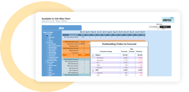
- Segmentation: There are various plants, and each plant has different vessels where different chemicals are used to create chemicals. We distributed the production and energy across various vessels, plants, and utilities for better analysis.
Solution To gain a deeper understanding of operations, we have created sophisticated analytics using production and energy distribution data. Lastly, to give thorough insights into the operation of these important assets, we developed specific energy distribution tabs for both oil and steam plants.
-
 Integration of files: Four "Energy" files were combined into a single "Energy Distribution" file.
 -
 Data optimization: To create a more concise dataset, unnecessary columns, tables, and measurements were removed. A new table with better formatting for calculated measures was introduced. Measures were used in place of calculated columns to increase the model's effectiveness. Additional columns were added for better relationships and date-based sorting.
 -
 Enhancement of UI/UX: The user interface was redesigned to match the company's logo colours. Top navigation has been added to every page to improve user-friendliness.
 -
 Drag and drop charts: Created Energy Distribution Pages for oil and steam plants and vessels using the drag-and-drop functionality to reorganize Cards, Line charts and Table visualizations while maintaining your layout automatically.
 -
 Embedded reports: Interactive Power BI dashboards and reports may be easily integrated into custom websites, client portal or applications using Power BI Embedded. Because of this, businesses may easily incorporate data visualization features into their own apps, giving customers access to comprehensive, interactive data analytics without requiring them to leave the application environment.
 -
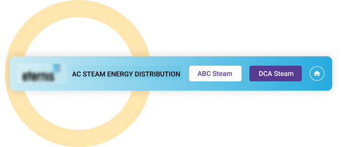
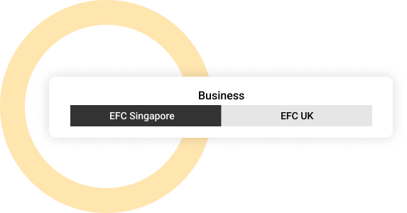
 Multi-Business location evaluation: Effortlessly switch between business locations using buttons to view location-specific data, aiding in comparative analysis and decision-making.
Integration.
Power BI offers many ways to work with other tools and apps, making it better and more compatible. For this report, we used some of the below integrations.
- SharePoint Folders
- SharePoint
- One Drive
- Excel Spreadsheets
- DataFlow

Customization.
We go beyond just charts.
We have built interactive visualizations that leverage the strengths of each matrix and chart type to bring the data to life. This ensures clear and accurate communication of insights.
Data-Dependent formatting
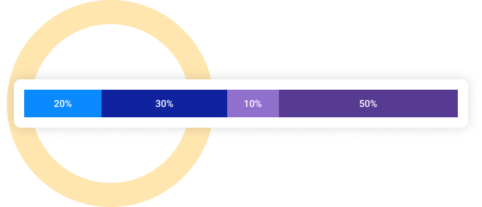
Apply conditional formatting to highlight rows based on specific conditions. This includes a change of background colours and the use of icon labels.
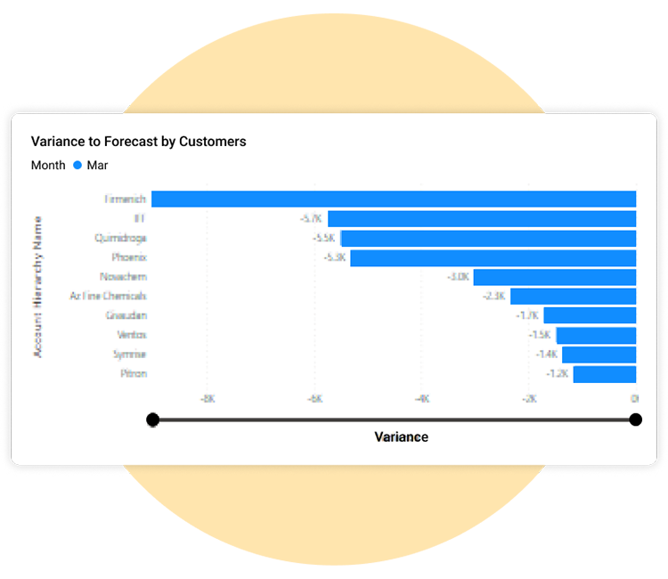
Chart zooming
We have added zoom slider in chart to focus on specific areas of interest for a more in-depth analysis.
Enhanced data exploration
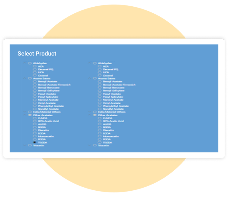
We built hierarchical structure from data, enabling slicers to provide deeper insights and facilitate drill-down into specific details.
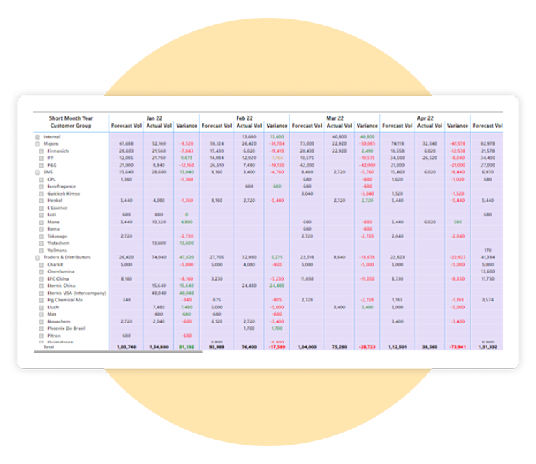
Data overview
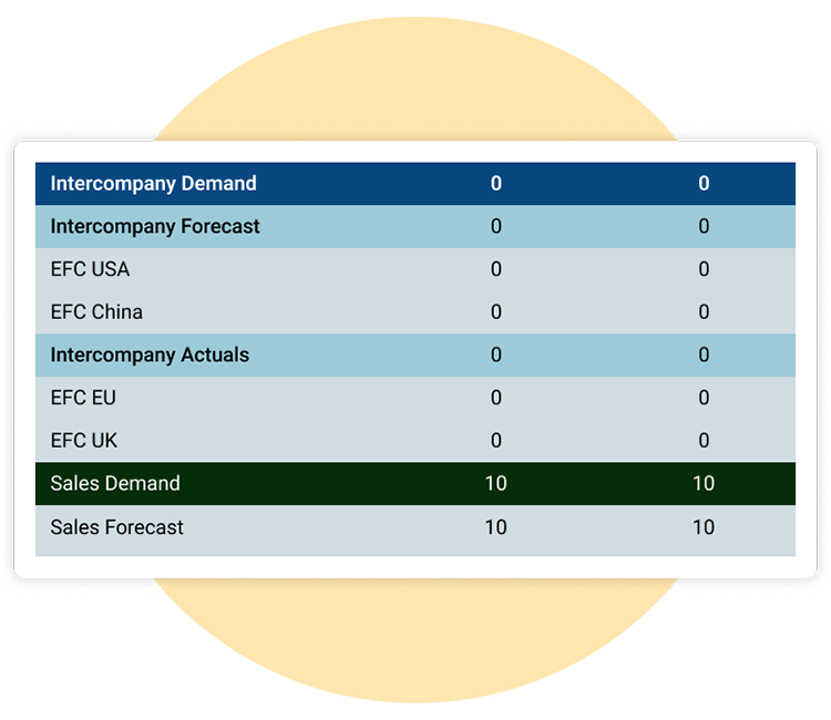
Incorporate multiple matrices and organize them into a single table for comprehensive analysis.
Enhancement.
By adding practical features.
We have enhanced the dashboard with features that make data exploration and visualization more interactive and engaging, leading to a more insightful experience.
Page navigation
Enhance chart navigation by using easily identifiable buttons to move between pages and return to the home page. Ensure seamless redirection to the home page with the home button.
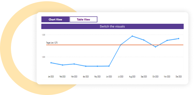
Switch the visuals
To provide users with options they can act upon, use interactive buttons in your visualizations. Users can easily switch from line chart visuals to table visuals.
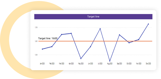
Target line
Users can easily get information about target values that need to be accomplished.
Customization by using colour palette algorithm
Used different colours for different plants, like acetate steam, acetate vessel, aroma steam, and aroma vessel.
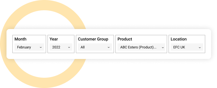
Slicer
Utilize different slicers, like Tile and Dropdown Slicer, to filter data and gain deeper insights.
Buttons
Dynamic report view through actionable buttons, enabling client to seamlessly switch between different location report based on their selection.
Customized tooltips
Effectively used tooltip that displays desired data information.
Explore more.
Additional features.
Improving the user experience with customized UI. Improved the visual layout, adding obvious navigational elements, and making most of the interactive features that are necessary to improve accessibility and functionality.
Expanded data label customization. Used new expanded data label feature that gave users granular control over the look and position of data labels, enabling accurate insight communication and improving the clarity of information display.
Conditional formatting. Utilized conditional formatting techniques to enhance insight and clarity in complex datasets by dynamically highlighting important data points.
Custom theme. Developed a unique custom theme tailored to the brand’s identity, ensuring the user interface was consistent and branded throughout.
Key performance indicators. Used a wide range of KPIs to assess and improve the chemical manufacturing industry's overall performance and productivity in a methodical manner.
Export preferred charts/KPIs. The export feature allows users to easily save it in a format that best suits their needs.Choose from various options, including formats like PDF, CSV, or Excel.