The goal of this Power BI dashboard is to provide real-time information on sales, inventory, customer trends, and supplier performance to industry stakeholders in the food and beverage industry. Boost productivity and gain a competitive edge by using real-time data visualization to support well-informed decision-making.
The core challenges
- Appropriate integration of data: The challenge of combining data from Excel files was solved by using an API. Our workflow was improved by using a centralized approach, which made it possible to integrate Power BI smoothly and quickly access data using SQL queries for more detailed analysis.
- Improving power bI performance: Our initial challenge was the slow performance of the Power BI dashboard due to complex data structures and large datasets, resulting in slow query execution times. To address this, we focused on enhancing dashboard responsiveness and optimizing data retrieval using DAX optimization techniques.
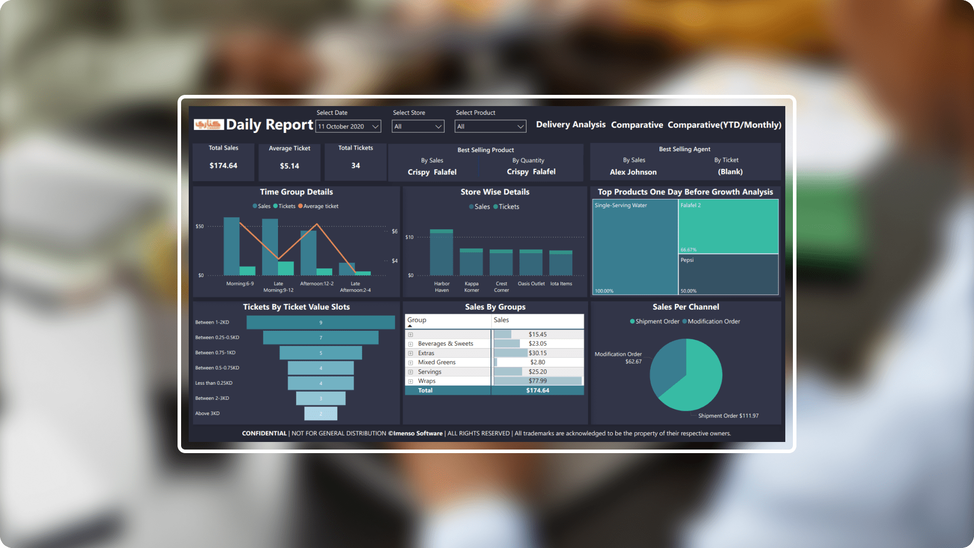
- Time-period data visualization: We added a new column that divided sales and ticket data by time of day so that hourly patterns could be examined. Because of this, it was simple for us to segment the data and identify trends and patterns. Better decision-making was facilitated by better visualizations.
Solution Our solution, which was created especially for the food and beverage industry, makes complex data simpler. It presents information in a clear and concise manner using charts developed for the food and beverage industry, it provides information in an easy-to-understand style that enables experts to make decisions fast.
-
 Data administration: Our SQL foundation helped us centralized all of the company’s data in one place. By creating a single location for all important data, this consolidation considerably improved business management.
 -
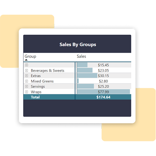
 Data simplification: Slicer features make it simple to filter data and provide key metrics a clear picture.
 -
 Custom colour themes: Choose a colour scheme that corresponds to client to assist them get more familiar with the dashboard.
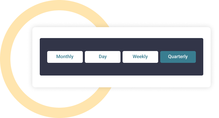
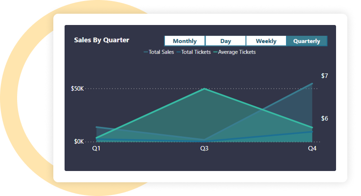
 Multi time frame: With the ability to switch between daily and weekly views, users can easily analyze Data over various time periods to suit their own preferences.
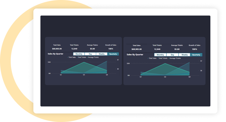
 Analytical reports: Divide a single page report into two for simple data comparison over two different dates or a range of dates by using Power BI's edit interactivity and bookmark capabilities.
 Embed reports: Power BI Embedded allows businesses to easily integrate eye-catching data charts and graphs into their websites or applications. Customers may access and engage with the data from within the app, saving them time and effort.
Integration.
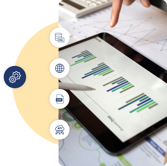
Equipped with a variety of
data source.Integration enables businesses to streamline operations, improve data accessibility, make better decisions, and create more efficient workflows. The following integration functionalities have been employed in the creation of this report:
- SQL Server
- Web
- CSV files
- External sources like APIs or web services
Customization.
How we played with charts?We did not just put in the charts we made them special to present data more effectively, ensuring each chart is perfectly suited for its use.
Built-in format capabilities
Put and colour bars based on the conditions after applying conditional formatting to a measure.
Custom card
created a special card where we included multiple values, each with its own currency, just like the client wanted.
Top sale
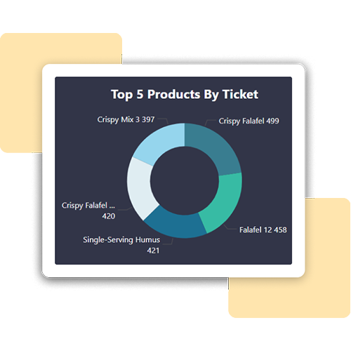
Developed a pie chart and a bar chart that show the top selling product based on sales. We set up conditions to highlight this top product.
Enhancement.
By adding useful features.A number of features have been incorporated to improve functionality and user experience.
Button
Add interactive buttons to visualizations to give consumers choices they can take action on.
Bookmark
Include an action called "Bookmark" in the button so that users may save and retrieve particular views or configurations.
Using edit interactions to improve engagement
We improve user interaction in our report by incorporating Edit Interactions capabilities, offering a more user-friendly and personalized experience.
Page navigation
Make navigating between charts easy by using dropdown menus or obvious back buttons.
Dynamic visualization techniques
Adding different kinds of charts, like line and cluster column, funnel, pie, tree map, area, line, donut and cards to makes the dashboard look better and makes the user experience more interesting and immersive.
Explore more.
Additional features.
Integrated authentication framework. An integrated single sign-on authentication system has been installed, which allow users to log into several apps with a single set of login credentials.

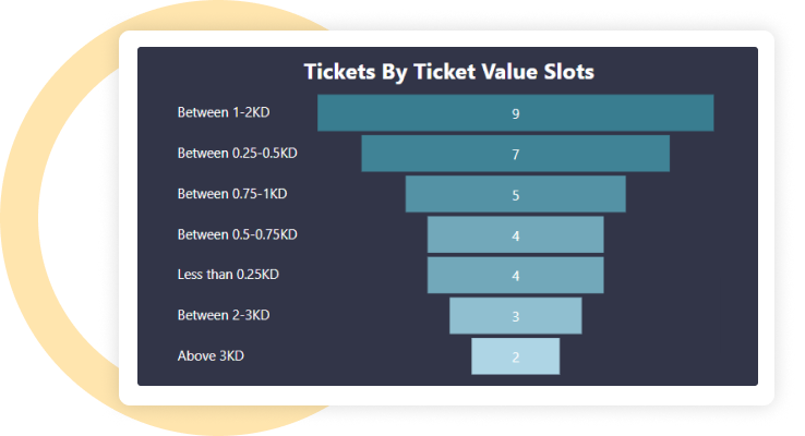
Creating food delivery KPIs.We have effectively combined a number of Key Performance Indicators (KPIs) to measure and improve effectiveness, productivity, and overall performance of food order and delivery business operations.

Export preferred charts/KPIs. Users can quickly clean up and save their data using the export feature. Here are some common ways to export a BI report: PDF, Power Point, Excel, CSV, Web, Service API
Looking to build similar
solution for your business?We have all the required expertise to help your business grow
How we can help?I would like to..
Learn more about software outsourcing